Tips for Decorating a Living Room with Dark, Bold Paint Color
This video and post is in partnership with Article.
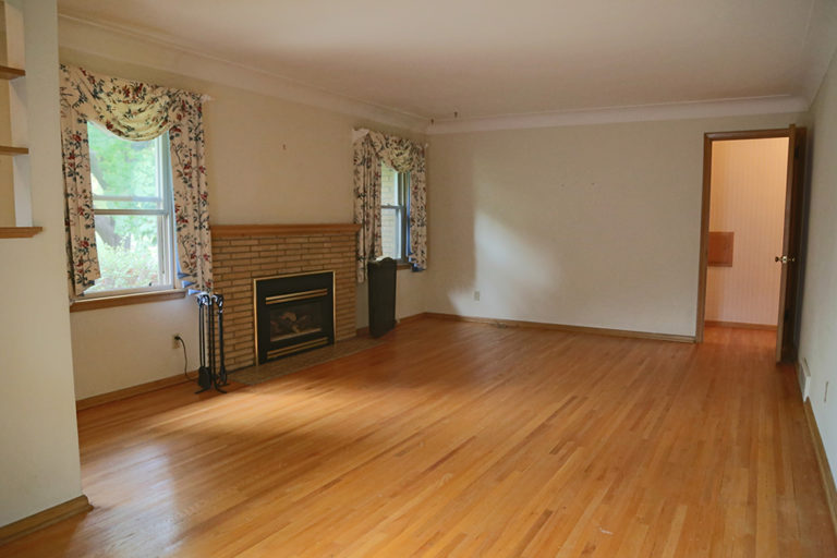
Welcome to my friend Jen’s front sitting room. This is first room that greets you when you walk into their home. They just purchased this home this past summer and asked me to help them make it their own. We opted to start off with this bonus living room that gets lots amazing sunlight all day long and great started place to create a finished space as the rest of their main living room is open concept. Here’s a look at what it looked like before…
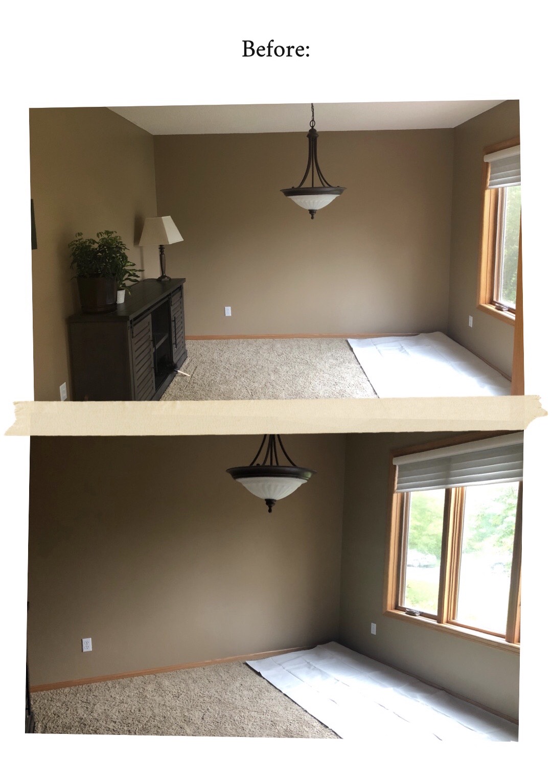
Their whole house was painted in the brown color by the previous homeowner. They eventually want to paint all the rooms on the main level in the large open concept area a light gray or soft white, so we though painting the walls a bold color would be a good contrast to the rest of the spaces in the future. They wanted to make this space a fun, casual entertaining spot for friends when they have guests over. So, we opted for a casual tv-free living room situation.
DESIGN GOALS:
- Replacing the hanging light with a semi-flush mount.
- Paint the walls in a bold color.
- Find furniture that fit their combined style, while also fitting the scale of the space. They really wanted pretty modern furniture that was comfy.
- Layout the space for entertaining, but also a spot to relax and enjoy a cup of coffee and book.
- Keep it kid-friendly as they have a little on the way.
- Add some personality to the space.
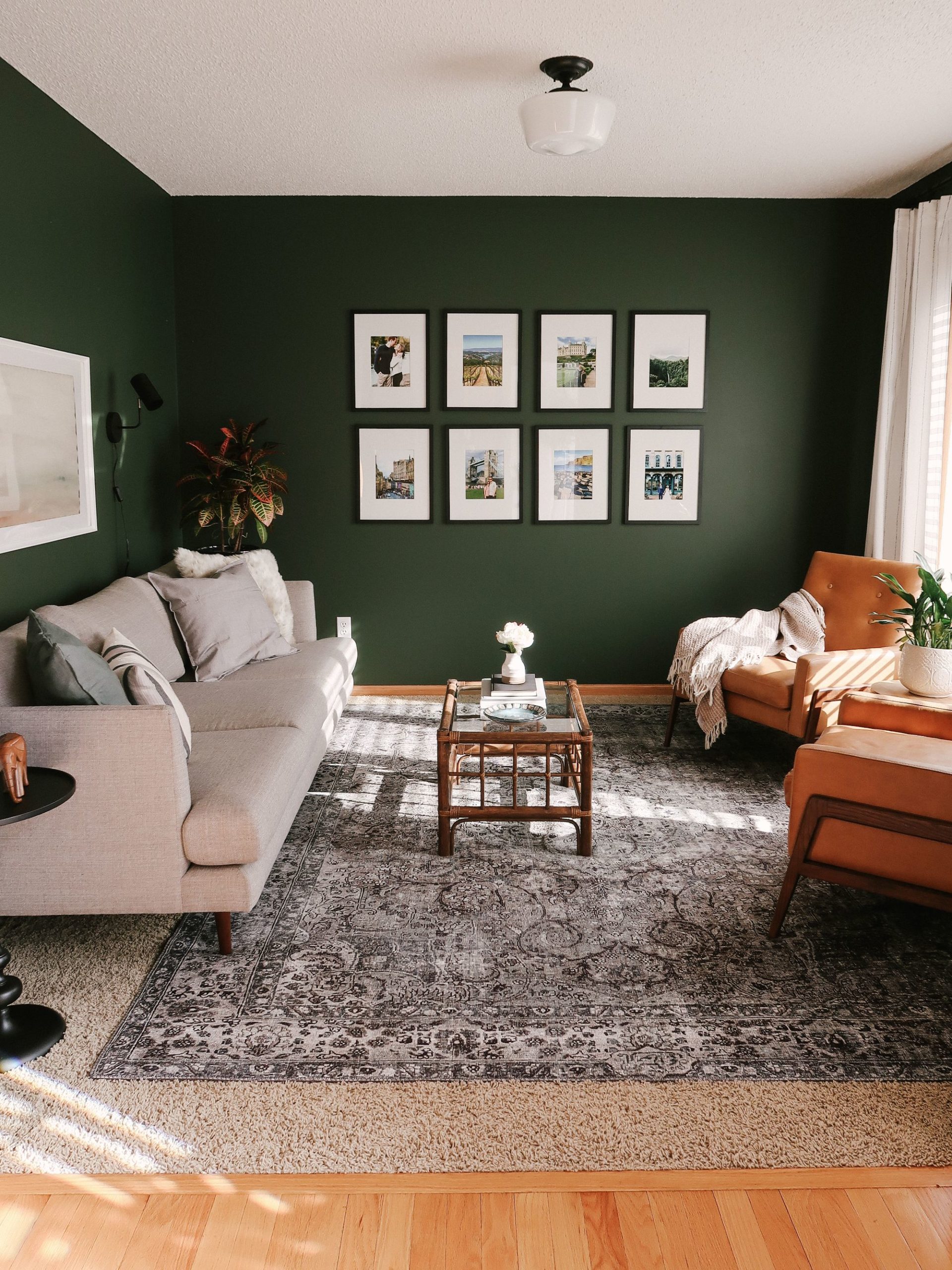
We replaced the lighting with a semi-flush mount light I had leftover from our bedroom after we installed a ceiling fan this last fall in there. It’s a simple modern schoolhouse vibe light with black accents that helps tie the space together.
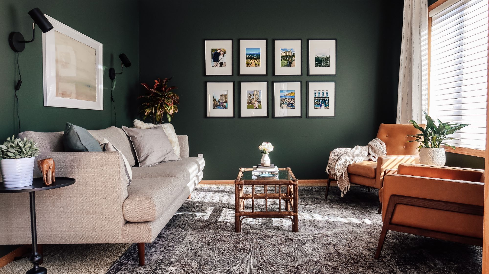
I’m obsessed with the deep green color we painted the walls. It’s “vintage vogue” by Benjamin Moore. It’s the perfect moody, warm, bold green color that doesn’t look emerald. Just the perfect dark green in my opinion. We layered in a rug over their current carpet from Loloi (Layla LAY-06 in Taupe).
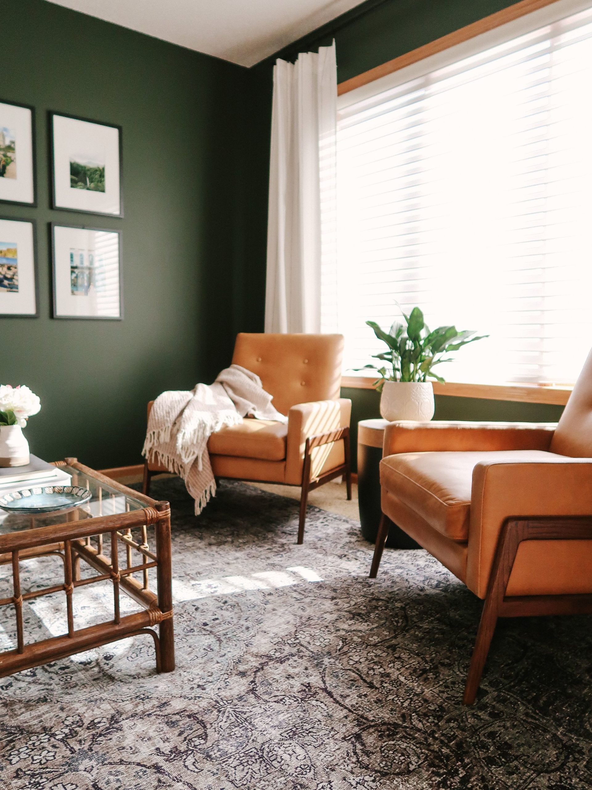
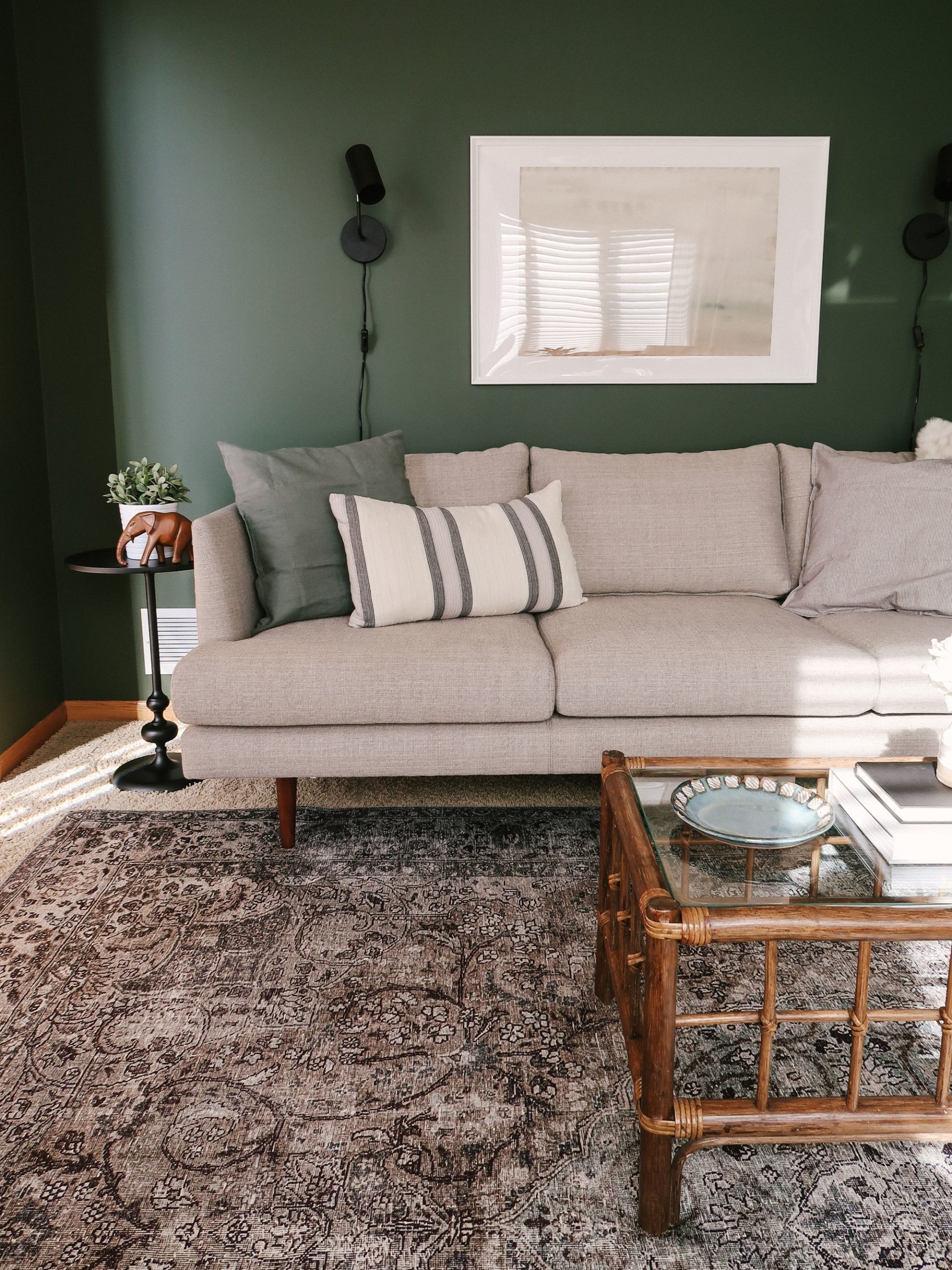
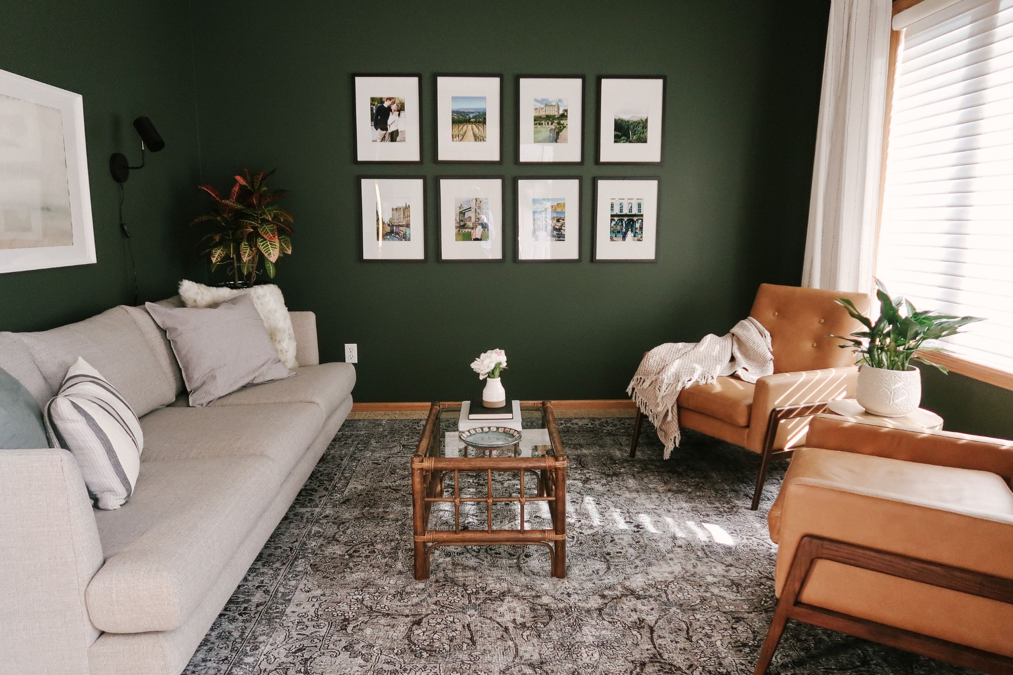
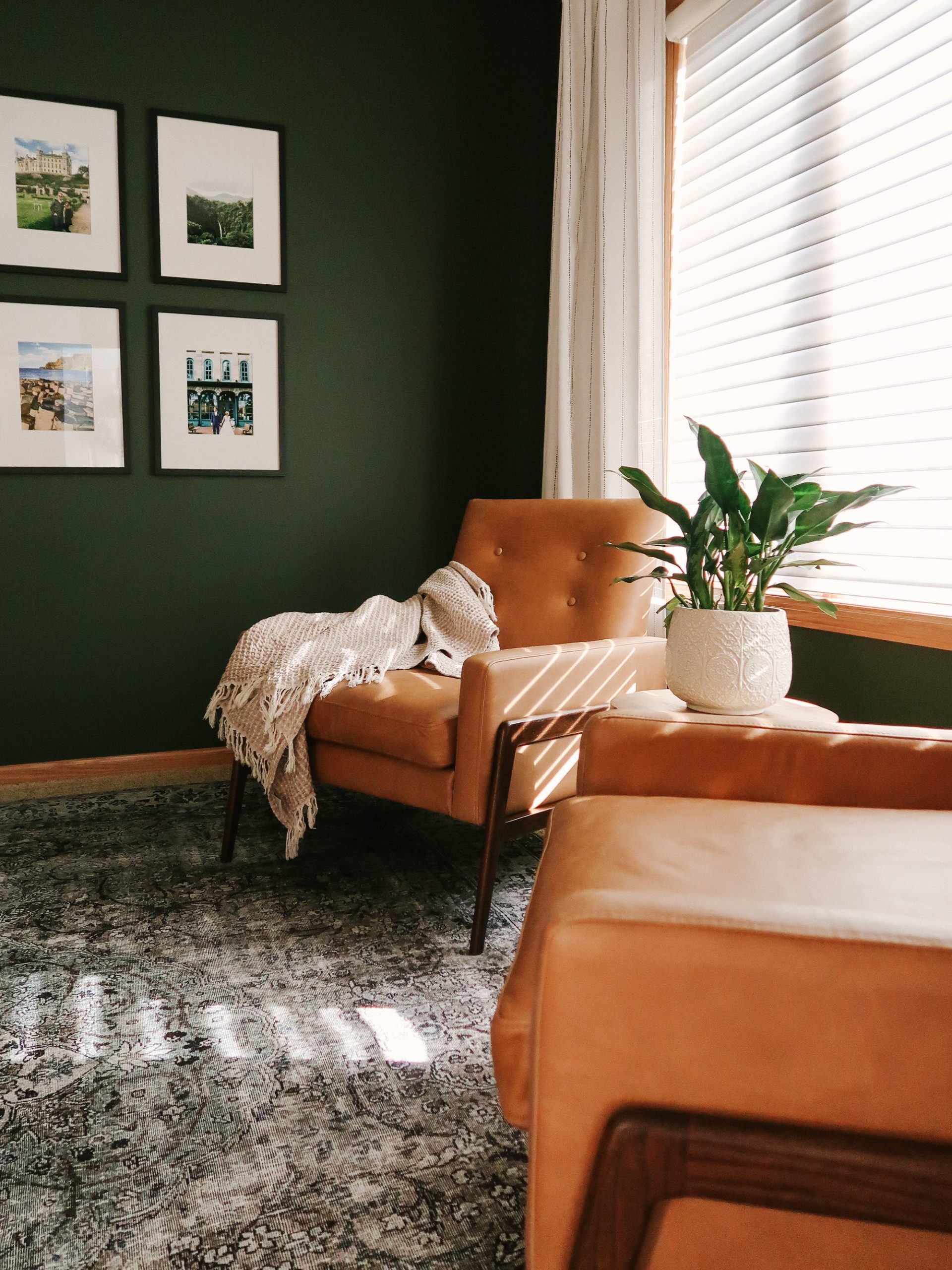
We created a very classic living room layout with a standard size sofa paired with two matching accent chairs. The sofa is a soft gray color that helps keep the room feeling lighter but not too light that a kid could totally destroy it. The Nord Charme chairs from Article add the perfect amount of warmth and keep with that mid-century style my friend, Jen, loves. They’re also very comfy.
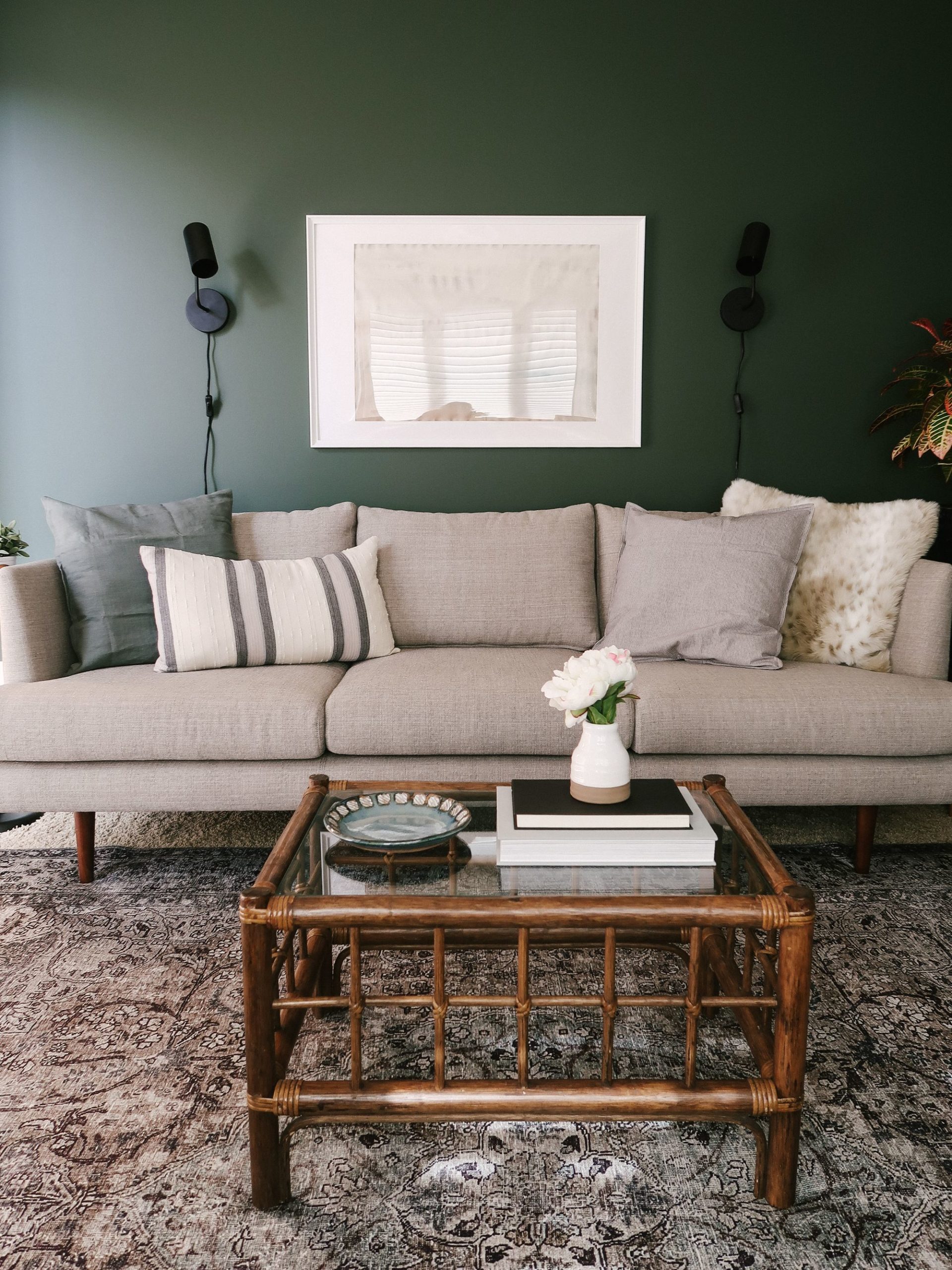
We floated the chairs off the wall by the window to prevent blocking light from the windows. The low profile back and arm design maximize the amount of light in the space. In the middle we added a small scale coffee table so that were was enough area to walk around the room. I love how the grid pattern balances off the grid of the gallery wall on the back wall. This was a thrifted find I had to alter (watch the video above to see me diy!).
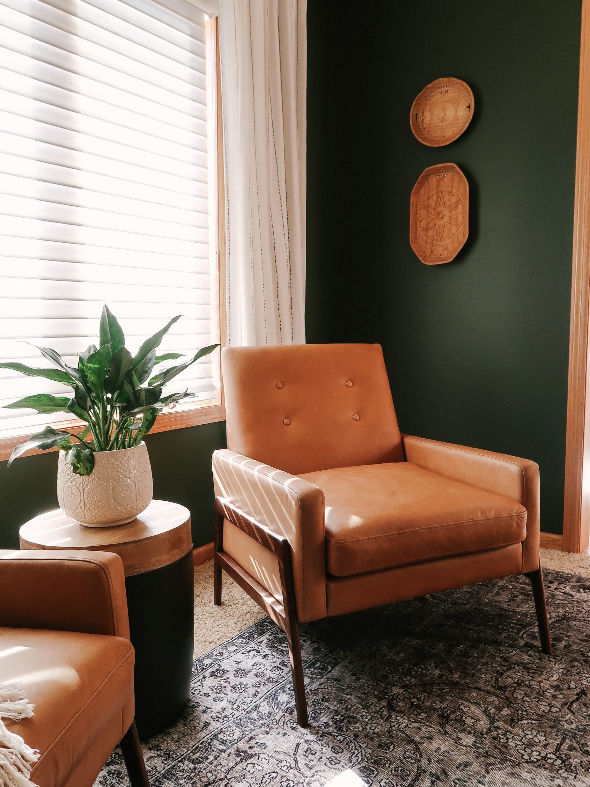
I also thrifted those wood carved plate looking things and hung them on the wall. I always like to have a room filled with 20% to 40% vintage or secondhand. This keeps it from looking too “off the shelf” and adds loads of personality.
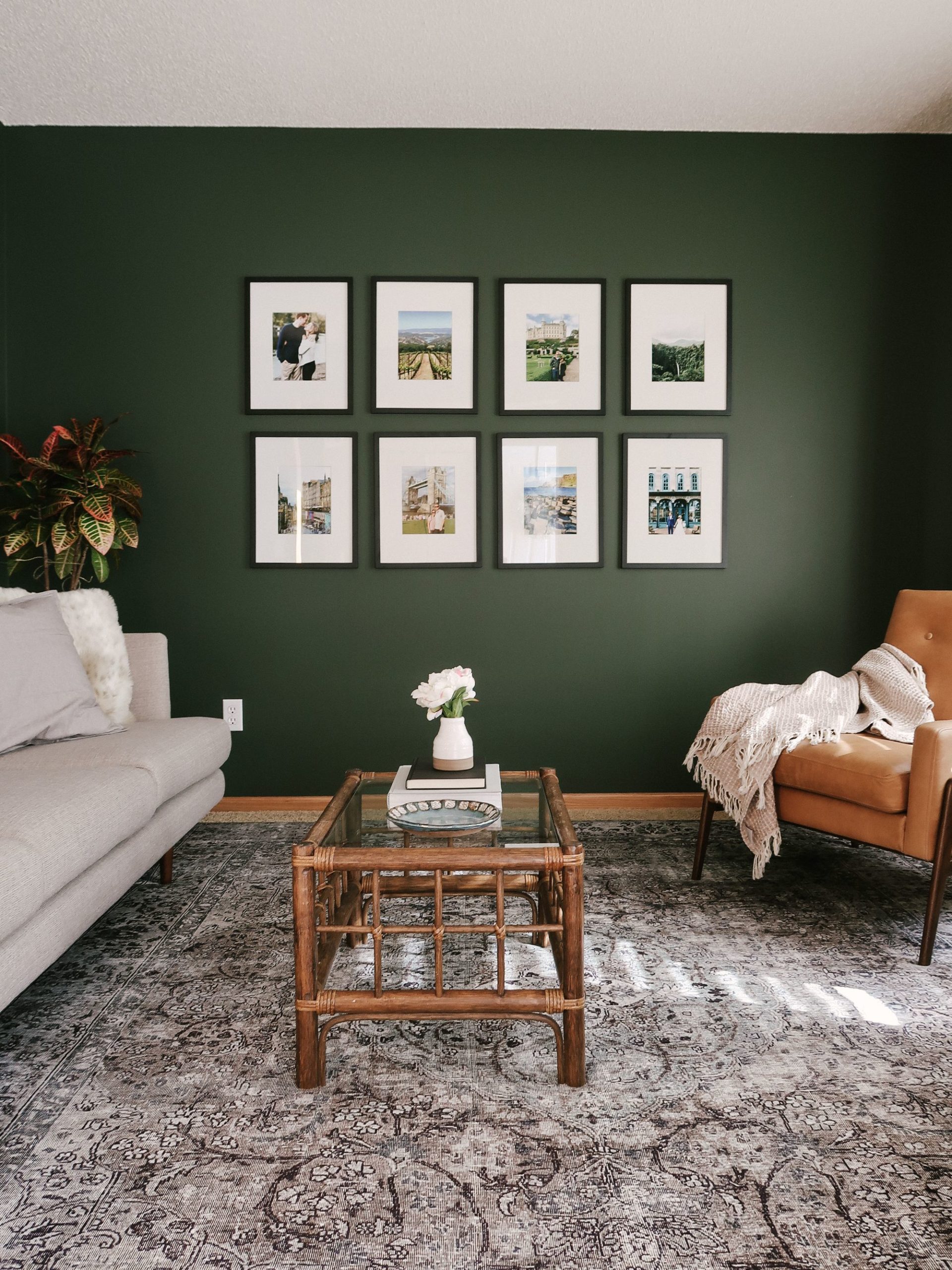

This gallery wall is my favorite moments in the space. We played with symmetry throughout the room. The grid layout of black frames with large white mats adds a focal point to the room. It also adds a personal moment as all the frames are filled with their travel photos and other special moments in their lives.

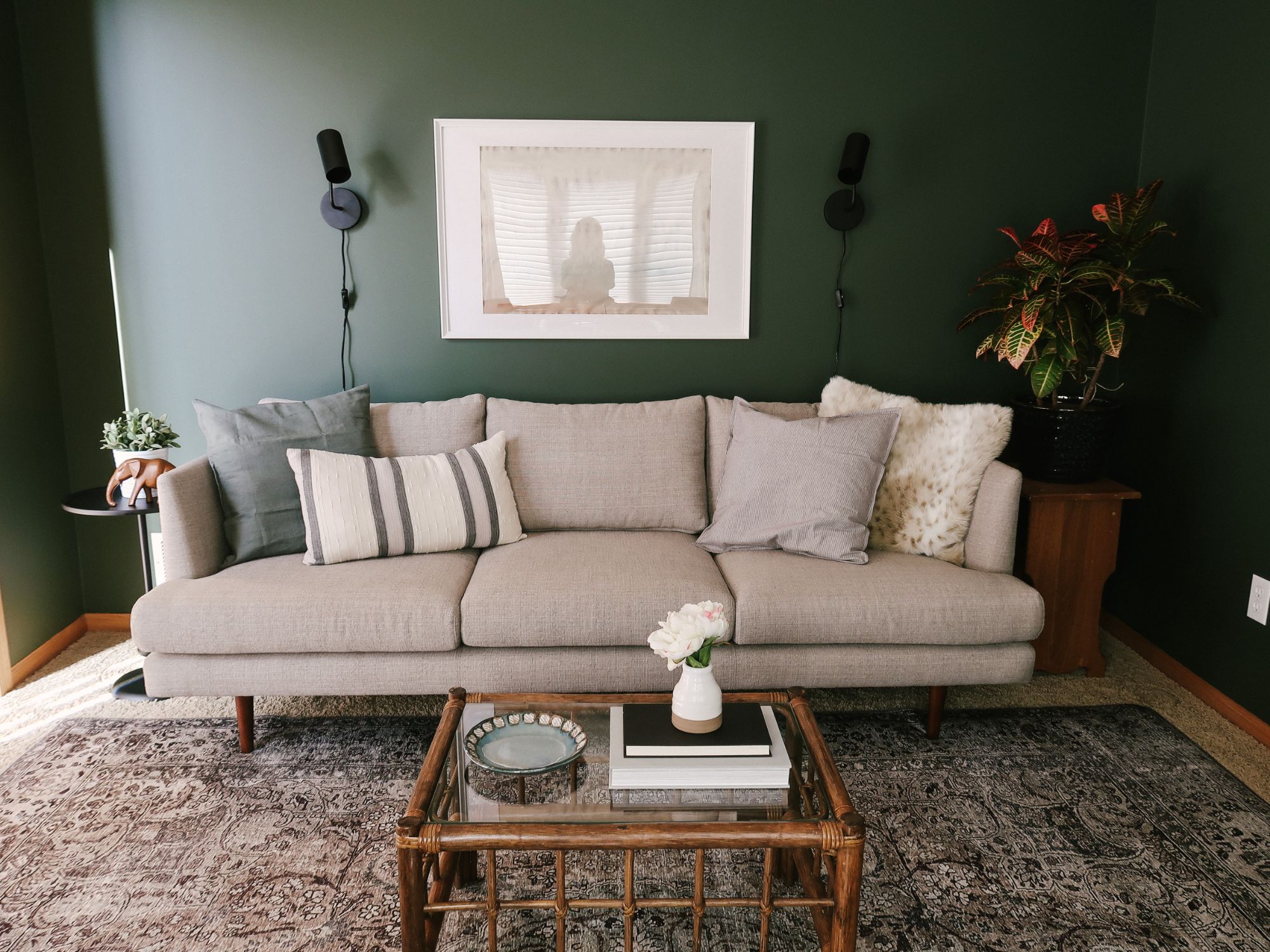
Above the couch we hung an abstract canvas art painting I made for them and put it in a simple Ikea frame. Since the frame was on the smaller size I wanted to visually add more space to either side of it with those black, modern wall sconces. Bonus, it keeps from needing any floor or table lamps. I’m so happy with how this space came together and thankful to Article for partnering with me on this room makeover.
SHOP THE ROOM
[show_shopthepost_widget id=”3913106″]
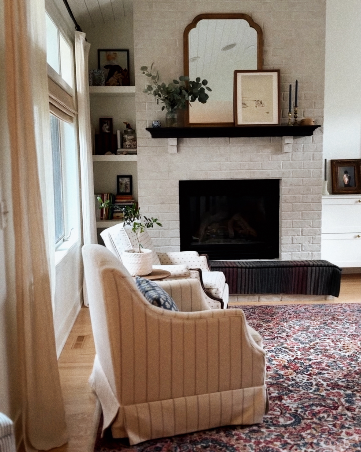

This room looks so well thought out and put together without feeling too perfect or stuffy. It looks collected yet thoughtful. I love it!!!
Thanks for sharing;)
Here we get to know about the tips for decorating a living room with dark, bold paint color information in detail. It helps us to decide that which one is best among its types. I enjoyed reading this article and would suggest others it as well. Thank you for this article! This is really very informative for us.
It provides the tips for decorating a living room with dark bold paint color. I would suggest the people to go through this blog before choosing bathroom tiles. I like how you have researched and presented these exact points so clearly. You must also check out hdpaintingservices.co.nz/ it has some great insights too.
HELP!! Where did you find rug????
It’s a Loloi rug. One of my favorite affordable rug brands!
I love this green paint. What shade and brand of paint is it please?
It’s Vintage Vogue by Benjamin Moore
Beautiful done! The shade of green is so on point – very grown up yet full of life. The gallery wall makes a fantastic focal point. Thank you for sharing – I loved it.
We all want to make our house beautiful and yes it’s hard, it’s not like changing clothes. People must choose the most suitable paint colour and furniture must look good and match the paint colour. Nice work, your article will help many people to achieve their dream home.
Hi, please could you tell me which green pain this is, I LOVE it, thank you
I found the colour vintage vogue, please can you share the finish?
Thank you!
I believe it’s an eggshell finish on the walls.
Where are the curtains from?
Doing the same colour in our living room and love these curtains!
Excellent makeover…! Awesome decoration and tips here. Your home looks great. I love your tips and ideas. You are so creative. I am impressed to see your decor. I wanna do this job. Thanks for sharing your post.
Hi! I was wondering where the rug in this room is from?
i love this room, im stealing all of your ideas, although being in the UK will have to hope that Farrow and Ball or Dulux have a similar colour, your tips on how to style the room were really good, will take onboard what you have said about rug sizes and curtains.
Farrow and Ball have the most beautiful colors!!
Where is this beautiful rug from?
It’s a Loloi rug!
hi, Beautifully done! i am so in love with it!! what color is the ceiling? thank you
Hi Kitty what style Loloi Rug is this? Would love to order a swatch. Thank you so much, the room is beautiful!
I love this design! I just bought a house and keep coming back to these pictures for inspiration. Thank you for the helpful tips. My living room is a similar size and darker wood trim. I’m curious about what paint color choices you would recommend for an adjacent dining room.
Where did you get the side table??
Was an old Target one that we painted black.
Beautiful room, I’d like to use that colour in an attic bedroom. What colour have you used for the ceiling? I can’t tell if it’s a light grey or cream.
We didn’t paint the ceiling so I don’t know the specific color but its a pretty standard white ceiling color.
Your living room is probably the most popular room in the house, so decorating it to make sure it’s a place you actually look forward to spending time in a must. And that brings us to color, since coming up with a palette will likely drive the design process and set the mood for years to come. Whether you want something bold and bright, neutral, or moody, we’ve got tons of living room paint color ideas for you to get inspired by ahead. All you have to do is put on your overalls and grab a roller (the hardest part will be deciding between all these designer-approved living room colors).
Brightening up a dark space is a common challenge when designing a room. While a major renovation can certainly correct the issue, knocking down walls or adding windows are thankfully not the only options. In fact, there are foolproof tricks that the pros use to add light through design details. From painting the ceiling to layering in accessories, we rounded up our favorite tips to help you let the light in.
Designer Kristin Kong hid a door to the basement behind millwork painted in Sherwin-Williams’ Black Fox in her home near Atlanta. The trick “makes the room look less choppy,” she says, since the dark color helps everything blend together. And never underestimate the power of a beautiful flower arrangement on the coffee table!
Blue walls give this stylish cabin-like living room in a Heidi Caillier designed home a surge of mystery. The down-to-earth materials and classic prints ensure a cozy cocoon-like atmosphere. The lesson? Dark walls will make any space extra cozy and intimate.
Thank you! That’s a huge compliment!
Hi Kitty! I LOVE what you’ve done with this room. I’d like to use it as inspiration in our master. I saw you said the rug was from loloi, but I’ve looked and can’t find any that match this! Do you know the color or style name? Thanks so much!
I’m trying to find this rug and can’t seem to find it! Do you know the Loloi style?