Baby-friendly Living & Dining Room Makeover
This post is in partnership with Article.com
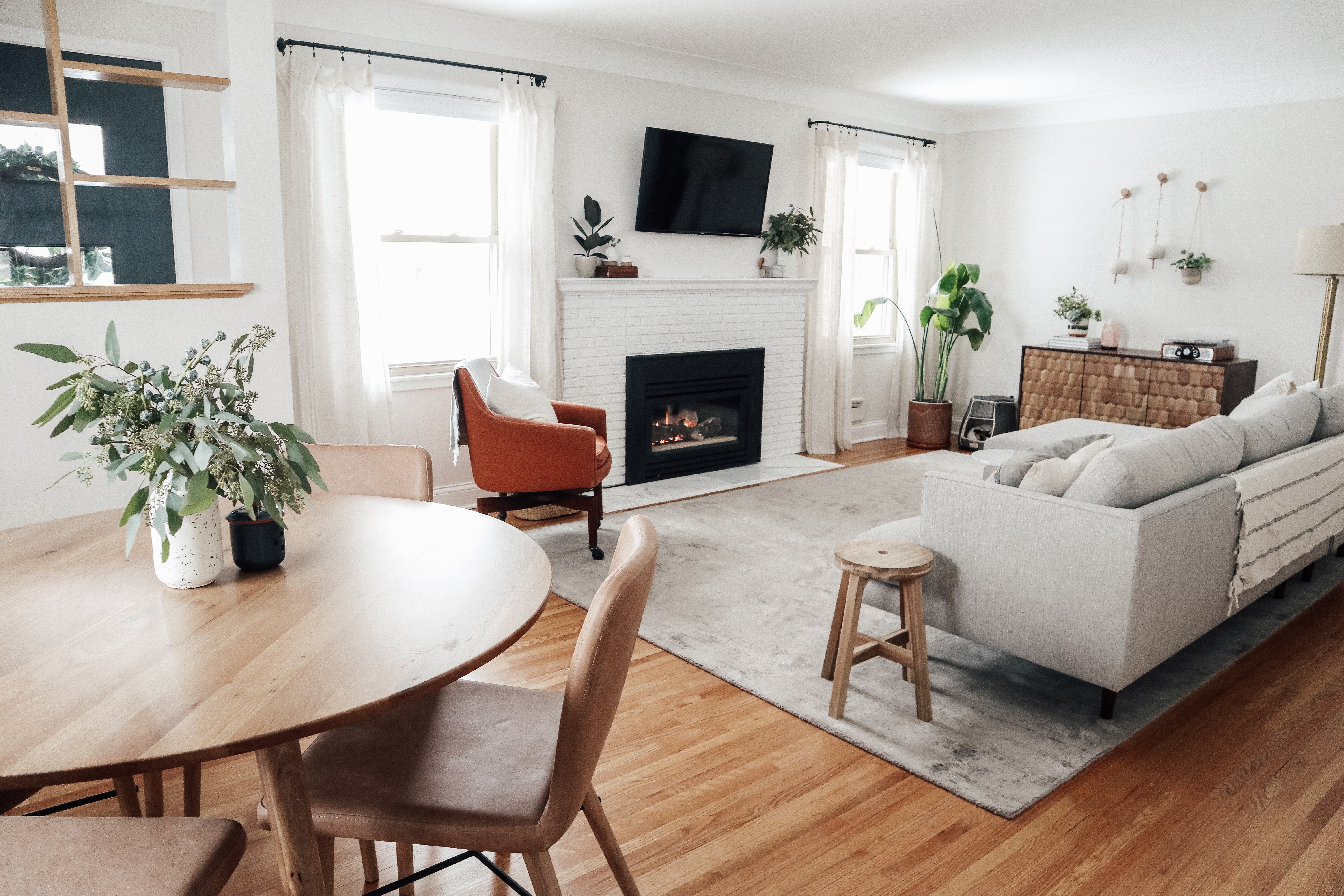
Ahhhh, this living room refresh feels so good. Our old living room was by no means bad, it just didn’t work with our new crawling baby girl! We knew even before Harriet was born that we needed to update the space with more baby-friendly furniture pieces (especially our dining set!) and make room for her stuff. The layout of the space shifted to having a TV above the fireplace, long, comfy sectional sofa for viewing, a sideboard for added storage and a much more study (and stylish) round dining set! We even managed to find some time to tackle what I thought would be a short, simple project of re-tiling the fireplace hearth. Spoiler alert: it was not simple or short. Now, lets dive into each area of the room… Oh, I almost forget to mention I repainted the whole room and hallway the most perfect warm gray color called “Seapearl” by Benjamin Moore!
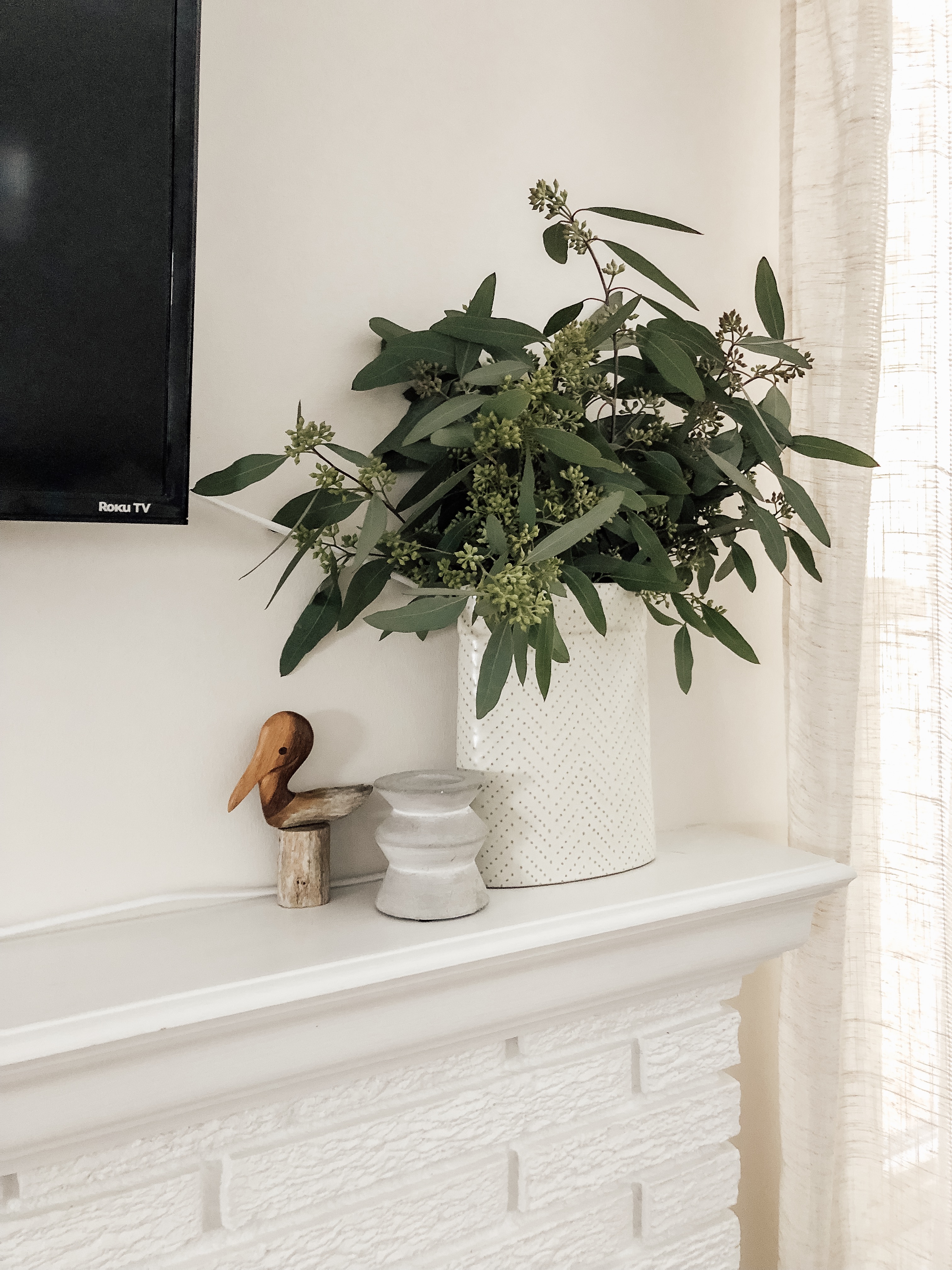
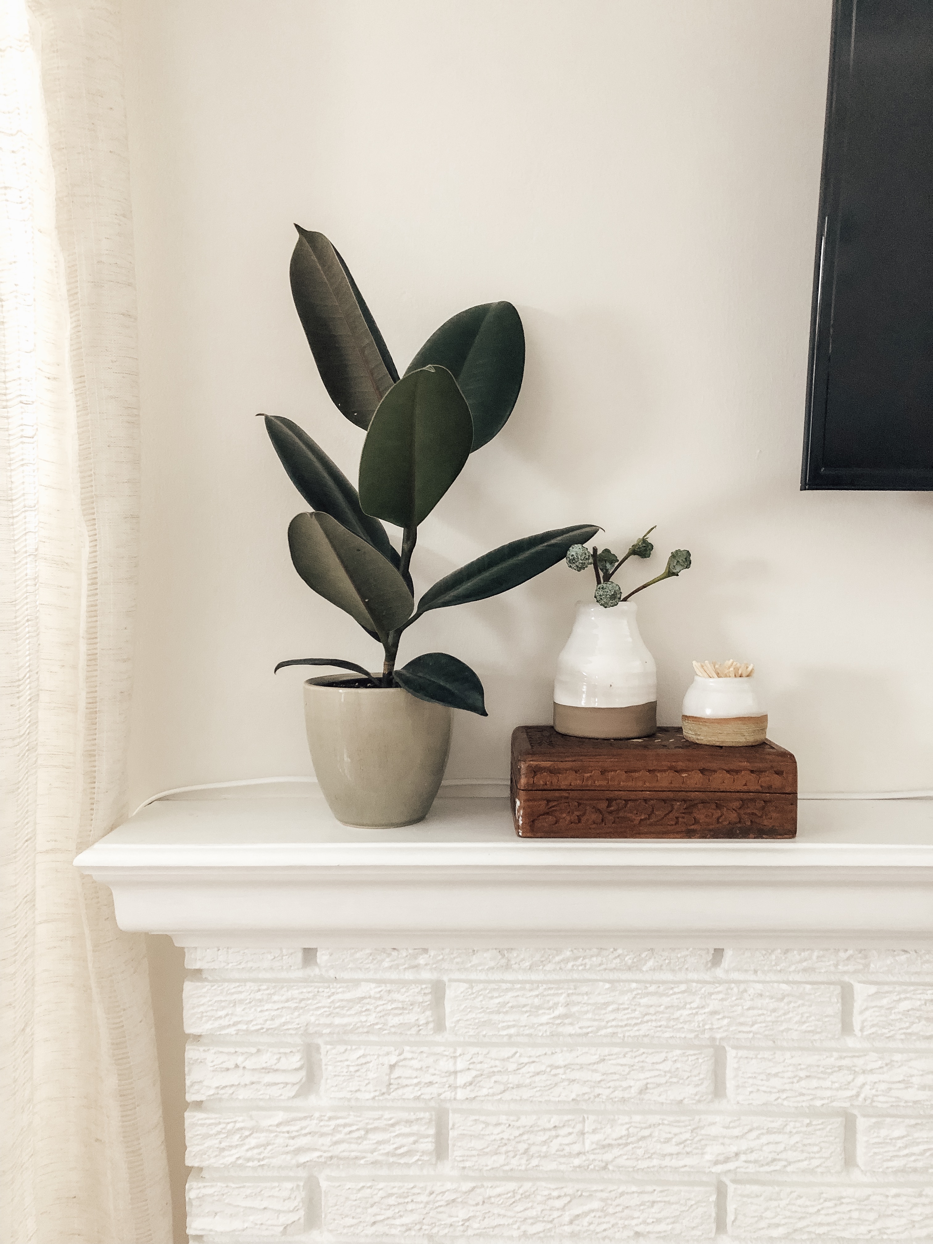
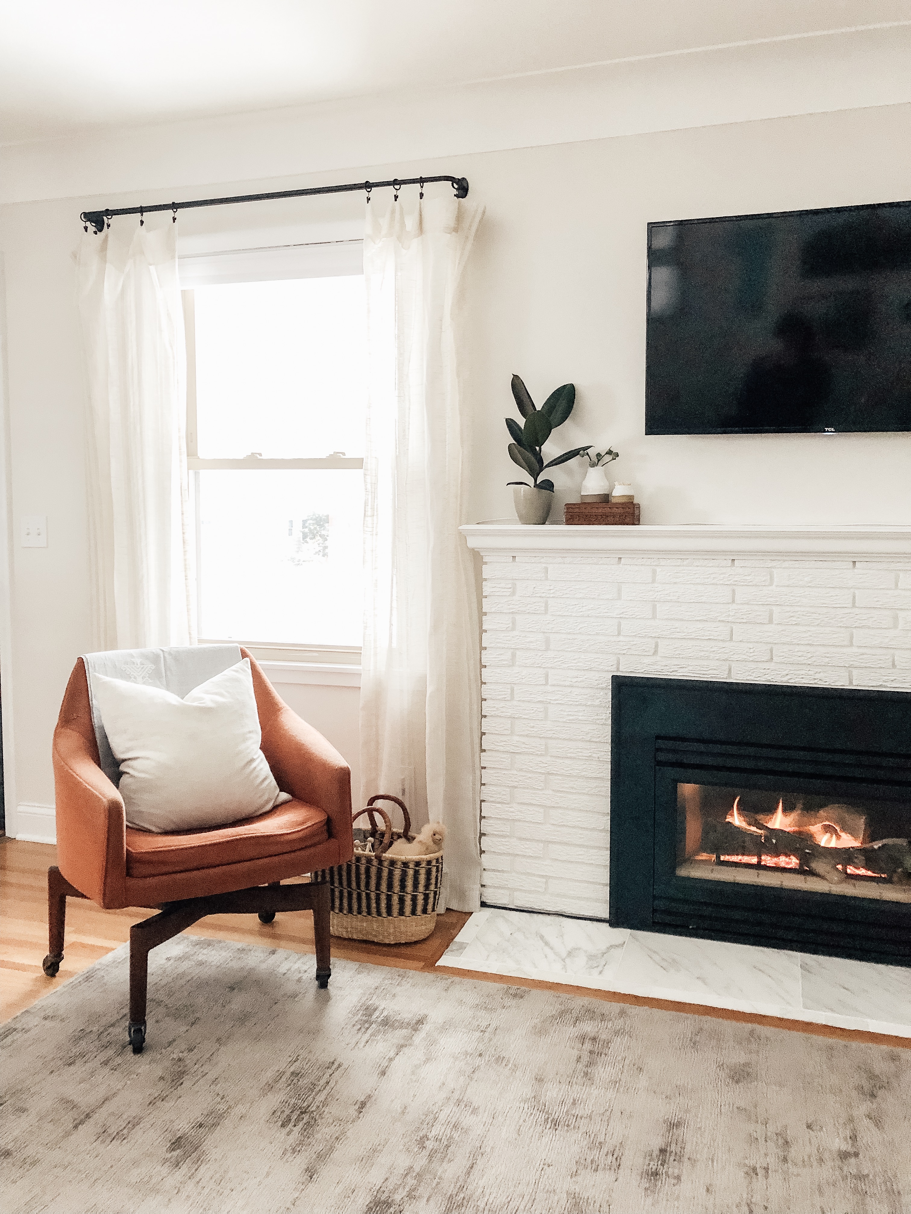
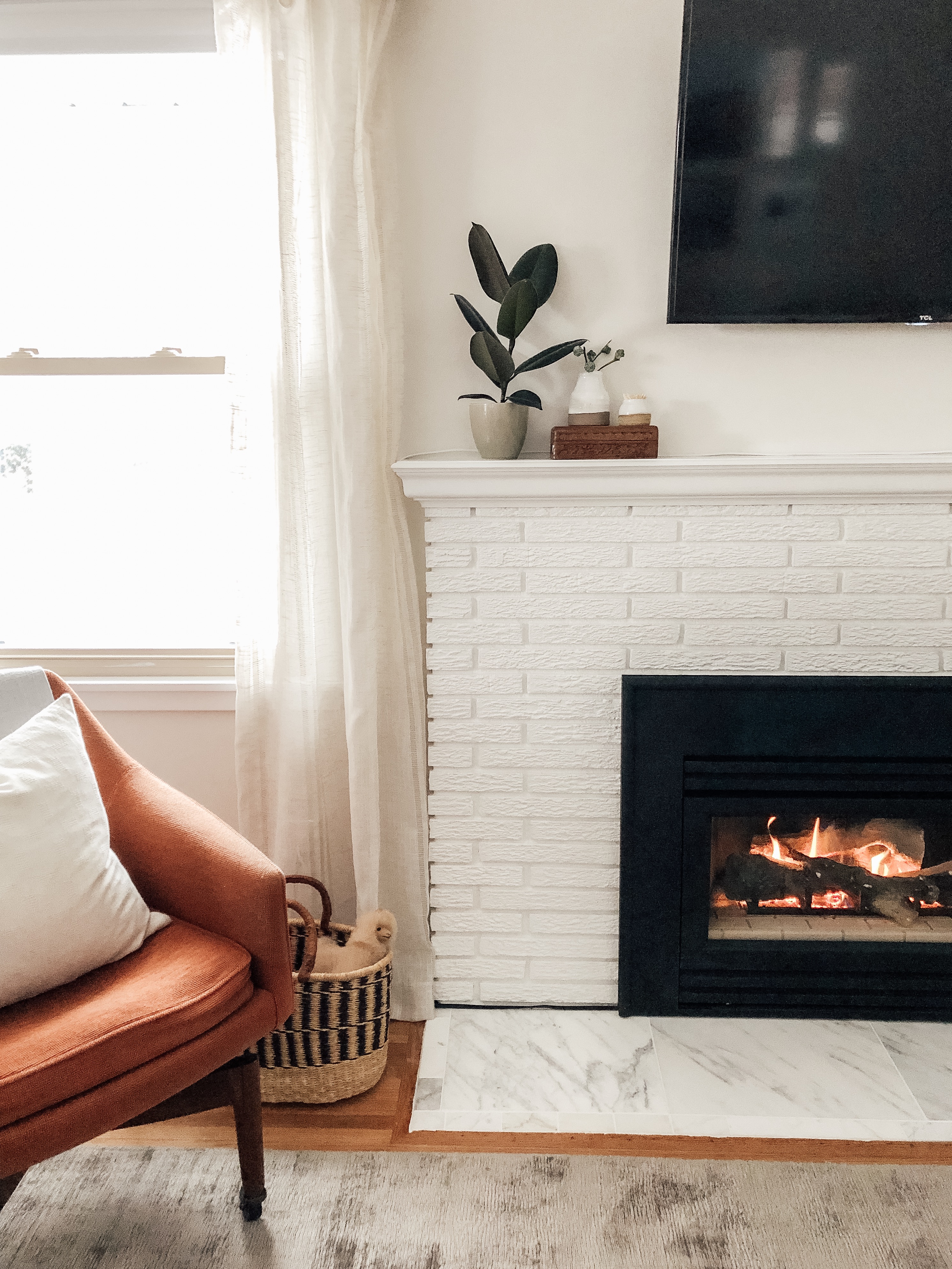
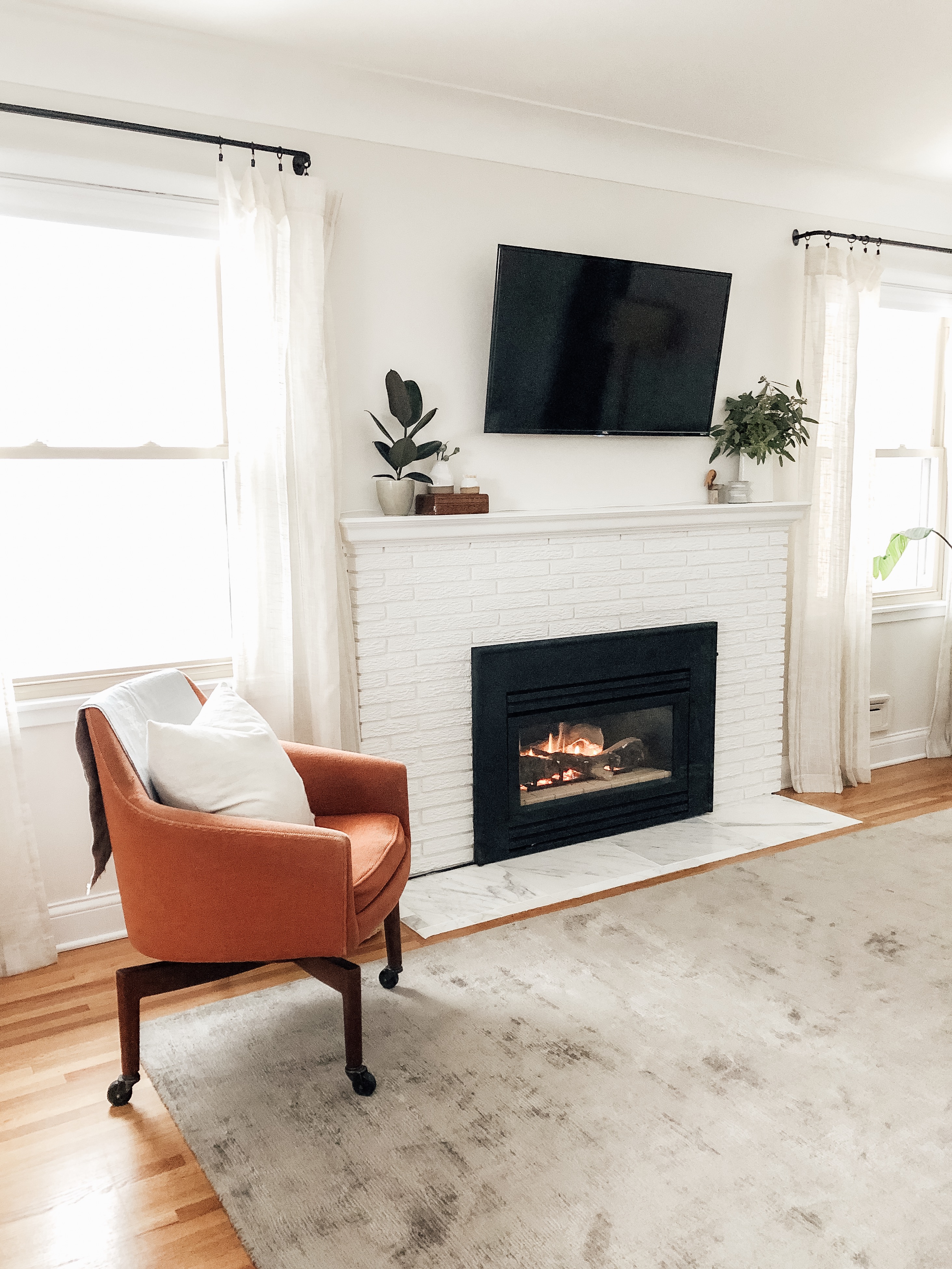
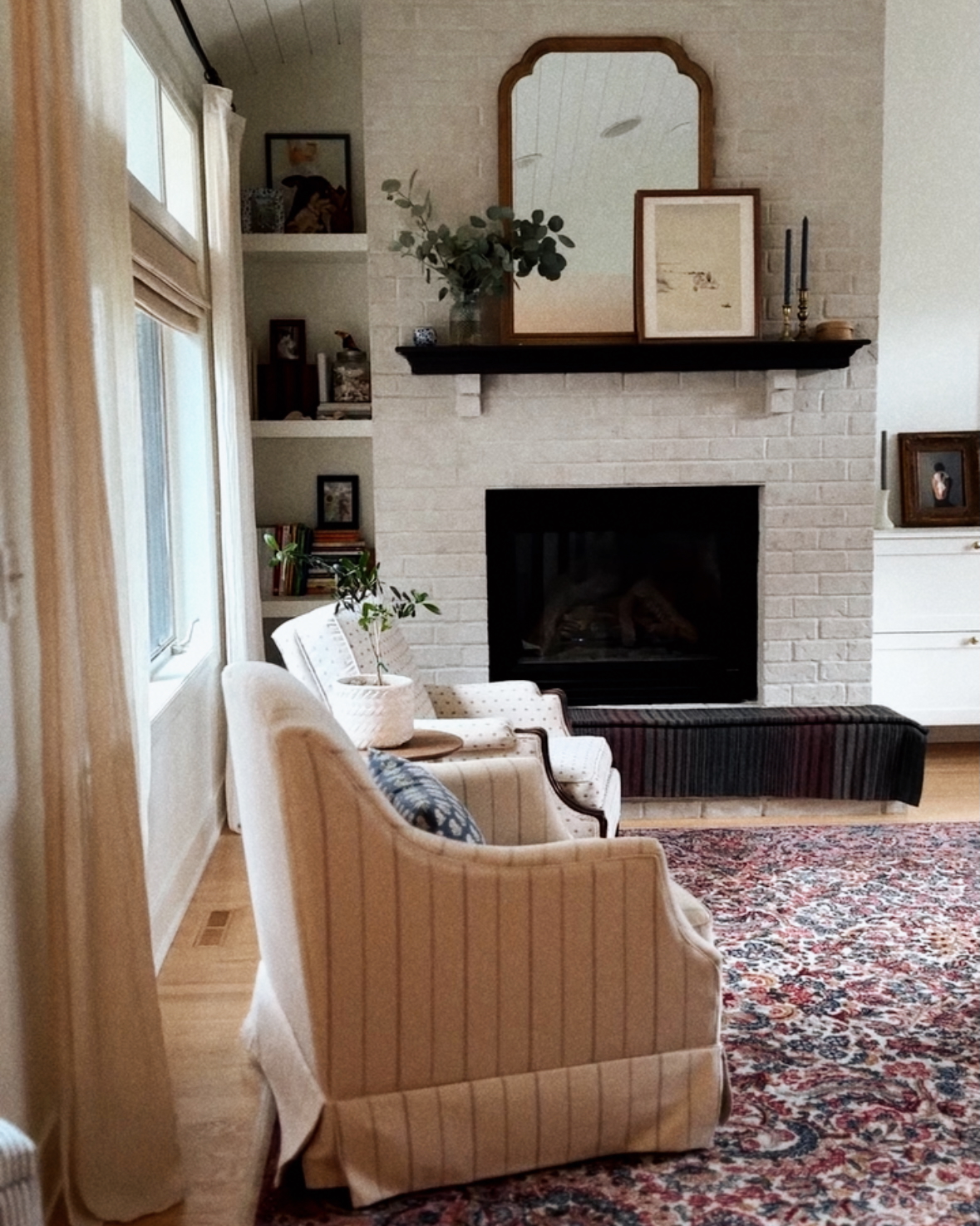
Fireplace
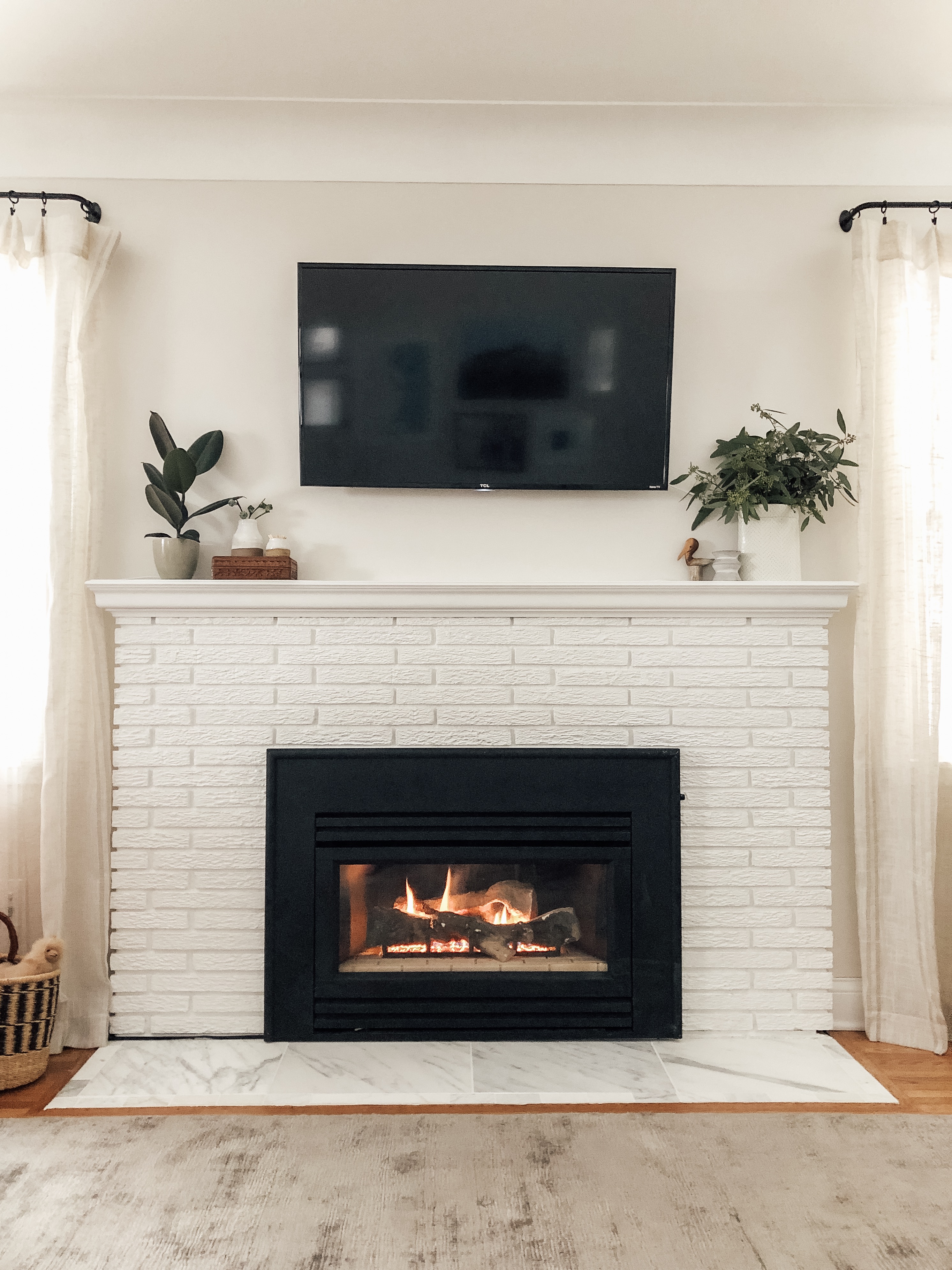
Sources: Article rug | thrifted chair (similar option) | Target vases | Target concrete candle holder (similar option) | DIY matchstick holder (similar option) | thrifted wood box | thrifted wood bird | Marble tiles | Woven basket for toys (similar option) | Home Goods curtains (similar option) | World Market curtain rods (similar option) | Amazon curtain rod clips | Target white pillow
While I’m not a huge fan of TVs above a fireplace, it was really the best layout for us and how we wanted the space to function. So, we got a smallish smart TV and mounted it above the fireplace. Having a smart TV is great because then we didn’t have to figure out how to hide accessories to watch Netflix or Playstation Vue. The TV originally came with a long black cord to plug in, but my husband, Joel, had a genius idea to buy a the same exact cord but in white. Genius! You can see it in the photos, but overall it hides fairly well!
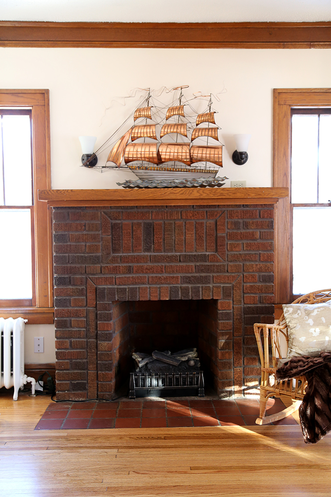
Now, onto the fireplace hearth. It was a tricky project, but I’m so happy with how it turned out! We (aka Joel) busted out the old tiles and mortar. We were left with a very uneven bed of concrete. We filled it in as best we could with new concrete. Then, we laid down a thin backer-board for the tiles to be installed on. This allowed us to install the new marble tiles flush with the wood floors. Before the tiles with fully above the wood floors. We went with honed marble. First, we installed a border of subway-shaped tiles. Then, we dropped in our four large slabs of marble. Sealed the marble, then grouted it with a white sandless grout. Sounds so simple now that I’m typing it out, but there was a lot of problem solving we had to do to get our tiles flush with the wood floors. Now, that it’s done I feel like it was definitely worth it and makes the space feel much more modern, yet still fits our 1950s home.
Living Room
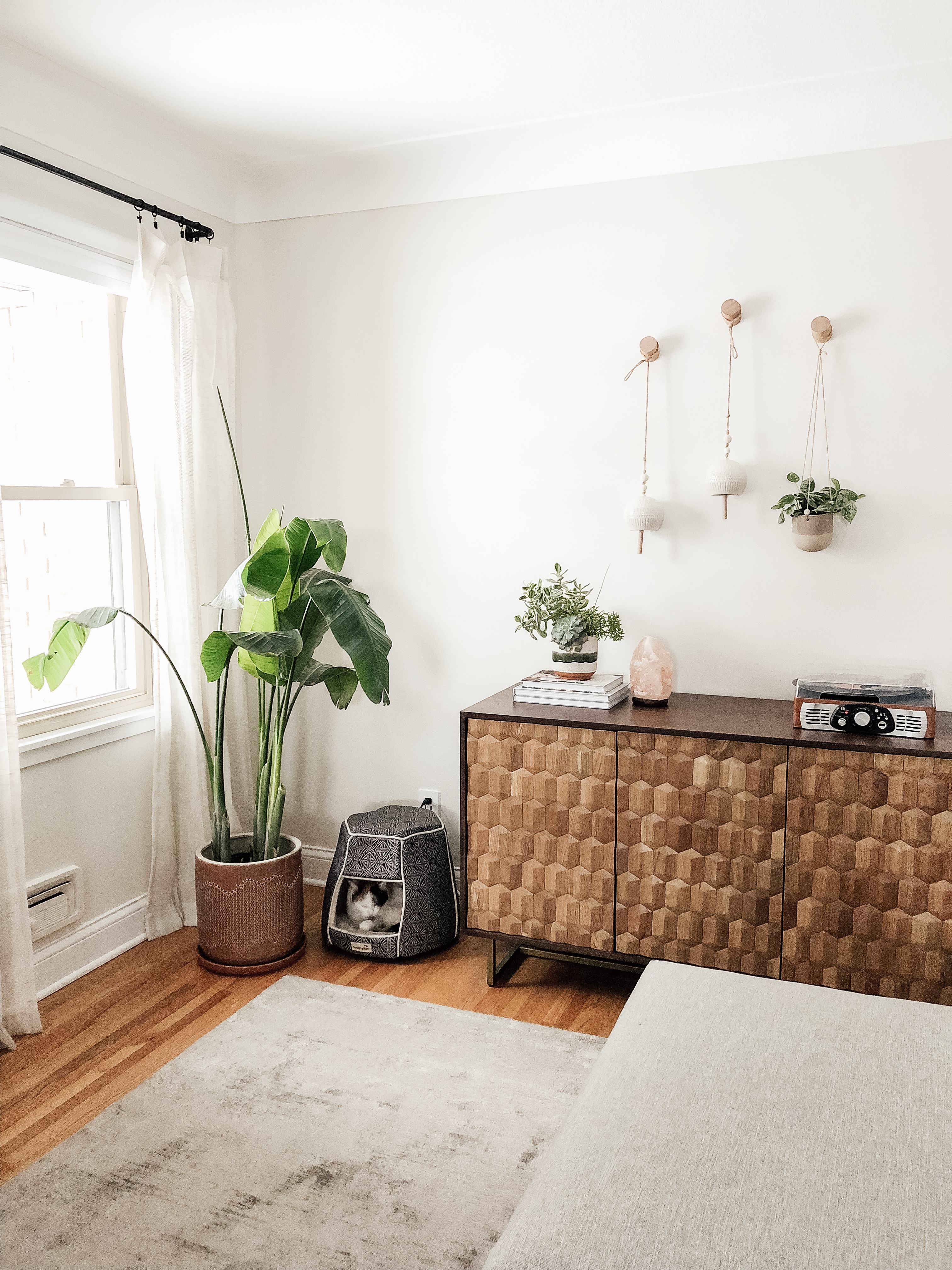
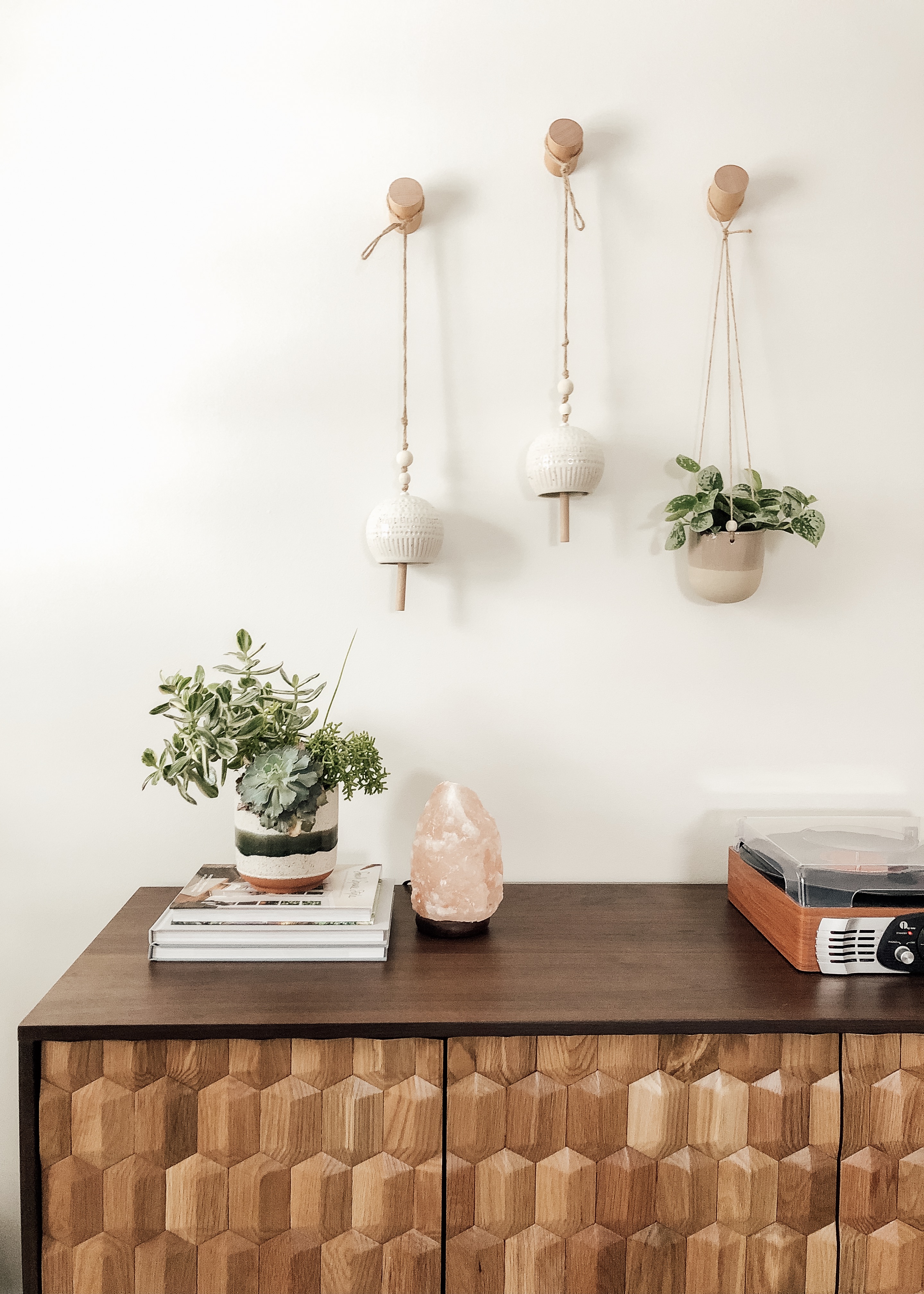
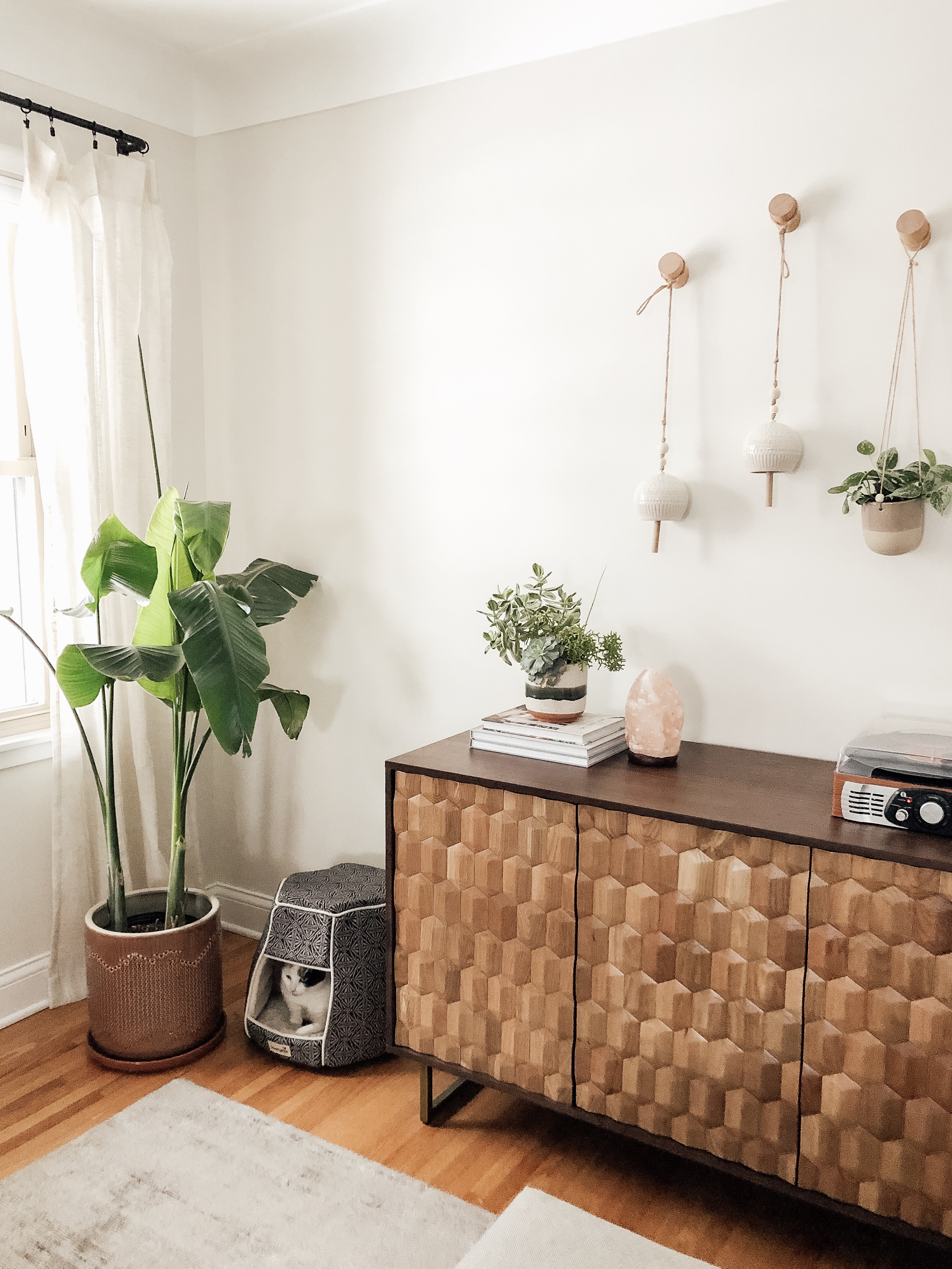
Sources: Article sectional sofa | Article rug | Article sideboard | Article marble table | Amazon wood wall hooks | Ceramic bells & hanging planter found locally (similar option) | Home Goods cat hut (cute woven option) | Amazon record player | Amazon Himalayan salt lamp | Planters found locally at Bachman’s & Tangletown Gardens | Wayfair brass floor lamp | thrifted record holder basket (similar option) | White gallery wall frames from Target | Wood gallery wall frames from Pottery Barn | Home Goods sofa throw pillows (similar option)
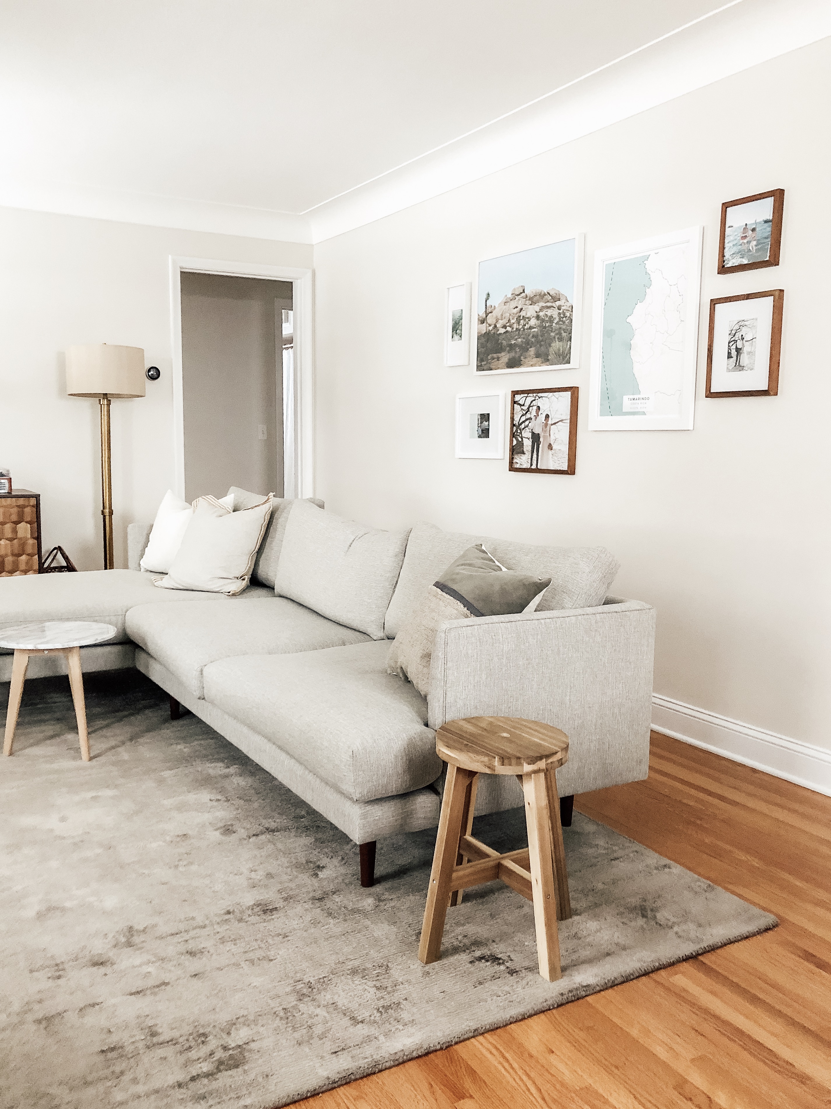
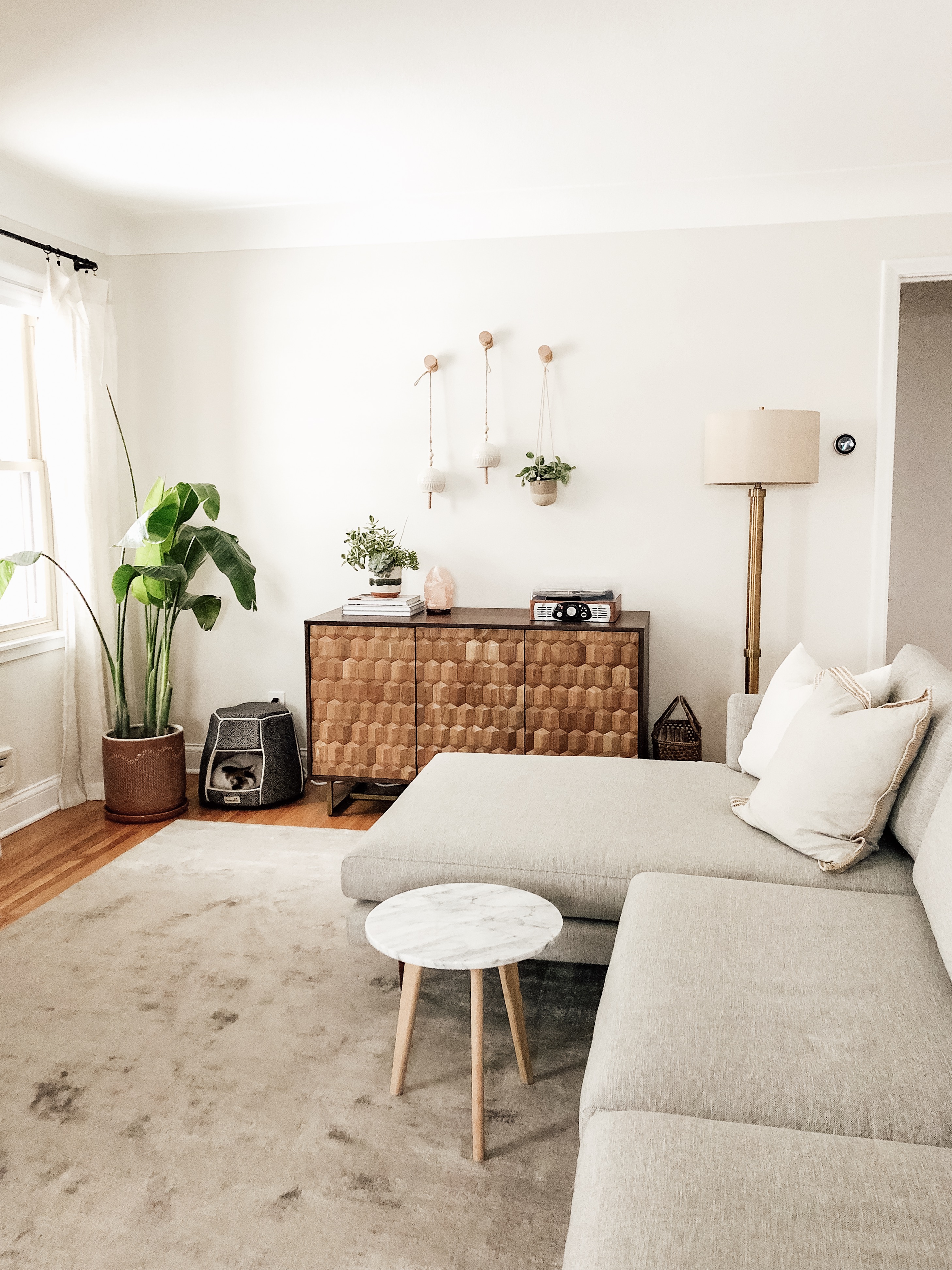
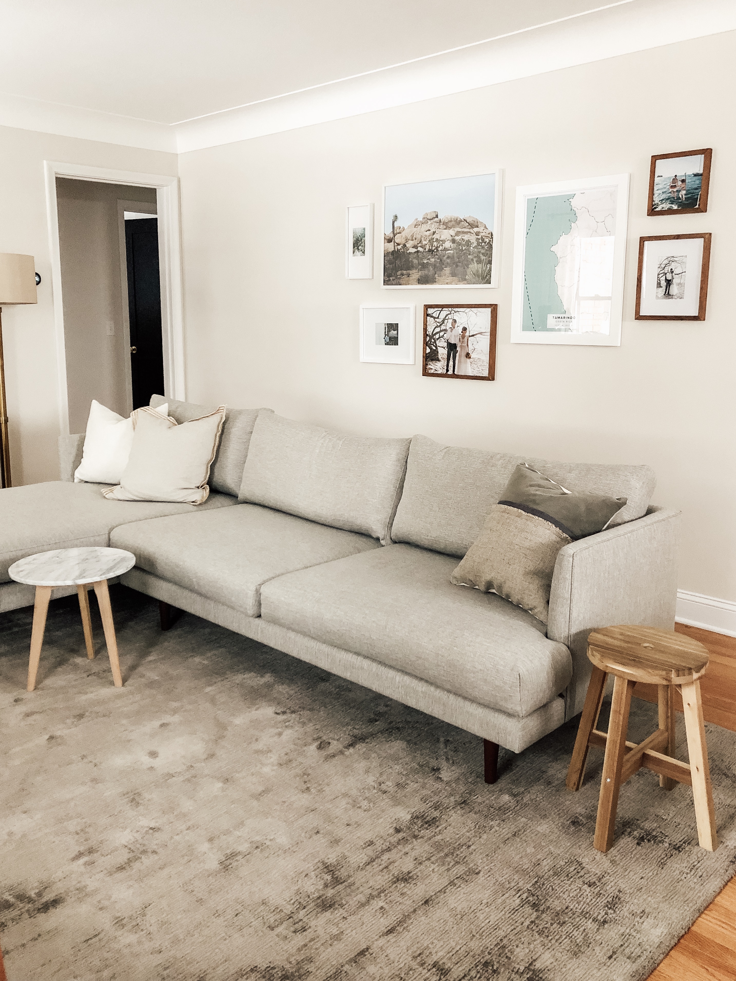
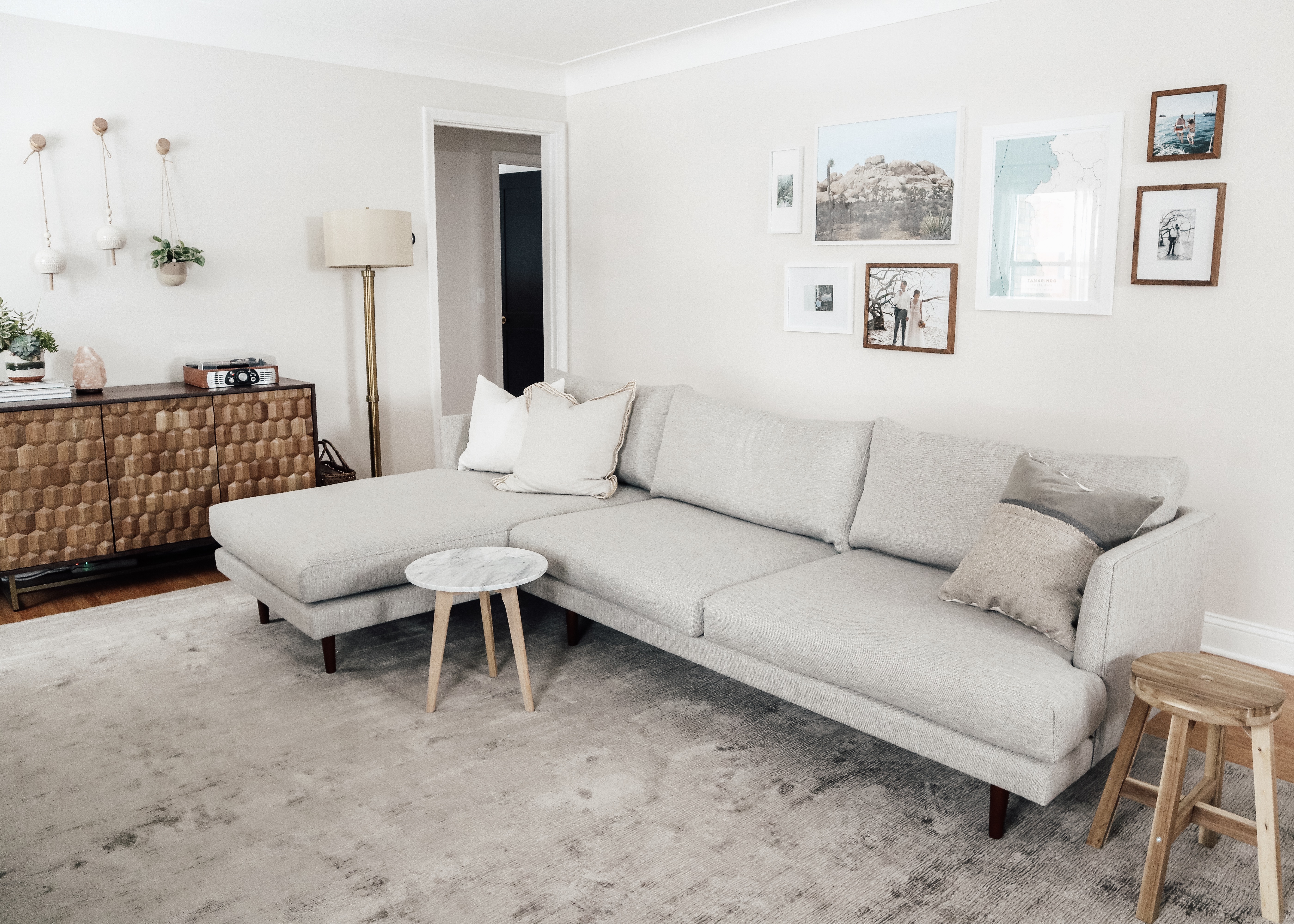
I absolutely love the new layout of our baby-friendly living room! We opted out of a having a coffee table to make more floor space for Harriet to play and crawl around. Instead, we added two small end tables, a marble one from Article and one that’s actually a stool from Ikea. This way we still have a place to set a drink and can even float them around the room as need.
Now, onto the big, beautiful new sectional sofa from Article! I’m digging this sofa. I easily fits four people and is the perfect setup for TV watching. The gray of the sectional and new gray rug from Article are a nice tone-on-tone feel. Another thing I wanted in the space was a more neutral palette, because baby stuff is anything but neutral and usually scattered all around this room. Behind the sofa I added a large gallery wall to help anchor the floating sofa and breakup the big gray wall that spans the back of the room.
Another favorite addition to the space is the new sideboard from Article. The raised hexagon door fronts are even more beautiful in person. The piece adds lots of warmth to the space and the doors add a great textural element. Even better, it has magnet closed doors that hide toys and blankets and candles and books out of sight. I love what’s happening on top of the sideboard. Our record player, Himalayan salt lamp, stack of photo books, and another plant. Then, the bell moment above it is a nice rest for your eyes versus more square frames on the wall.
We didn’t forget about our fur baby. She still has her little hut in the corner. I swapped out the planter for the banana leaf palm plant for a heavier sturdier one Harriet can’t tip over.
Dining Room
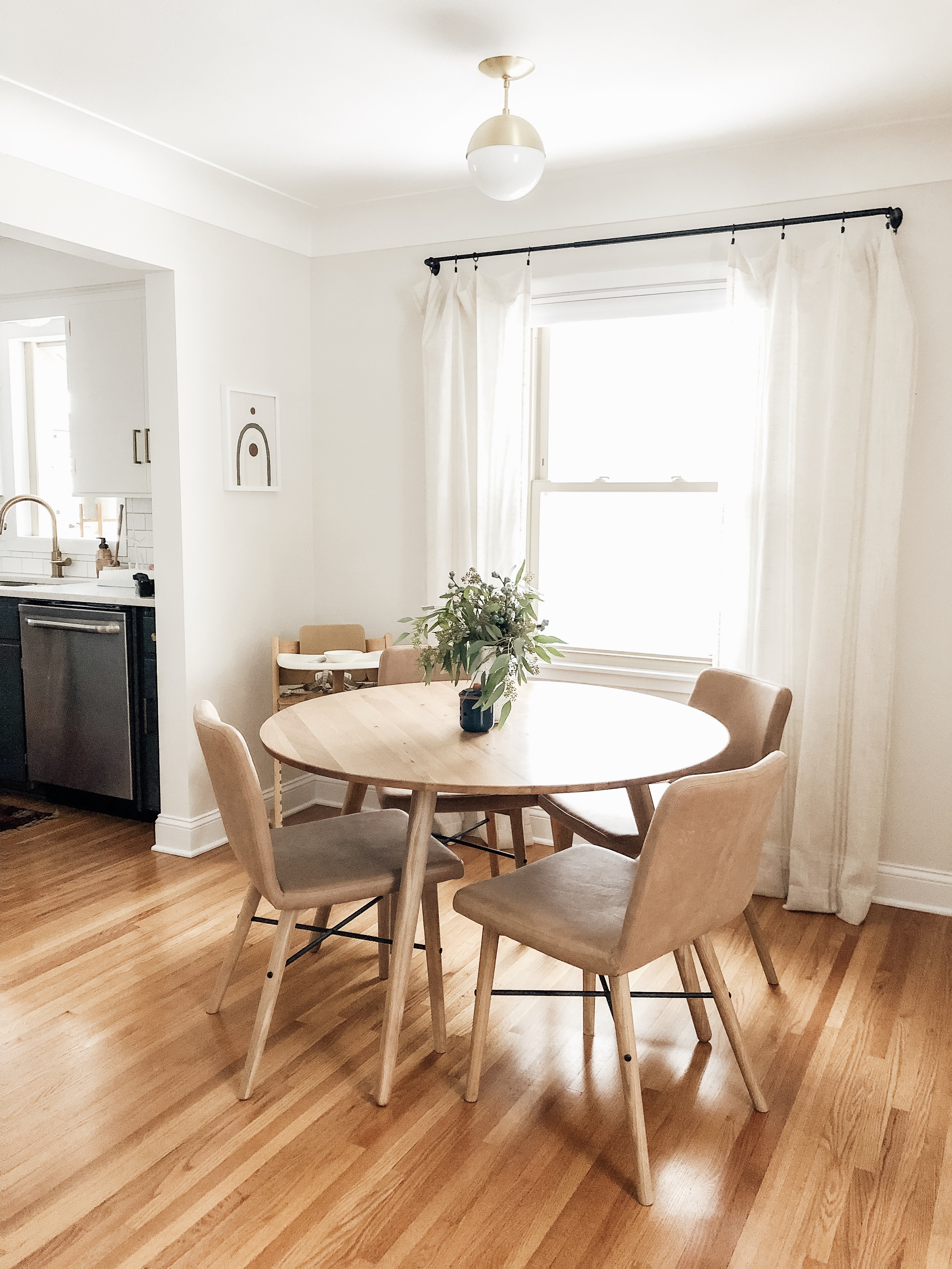
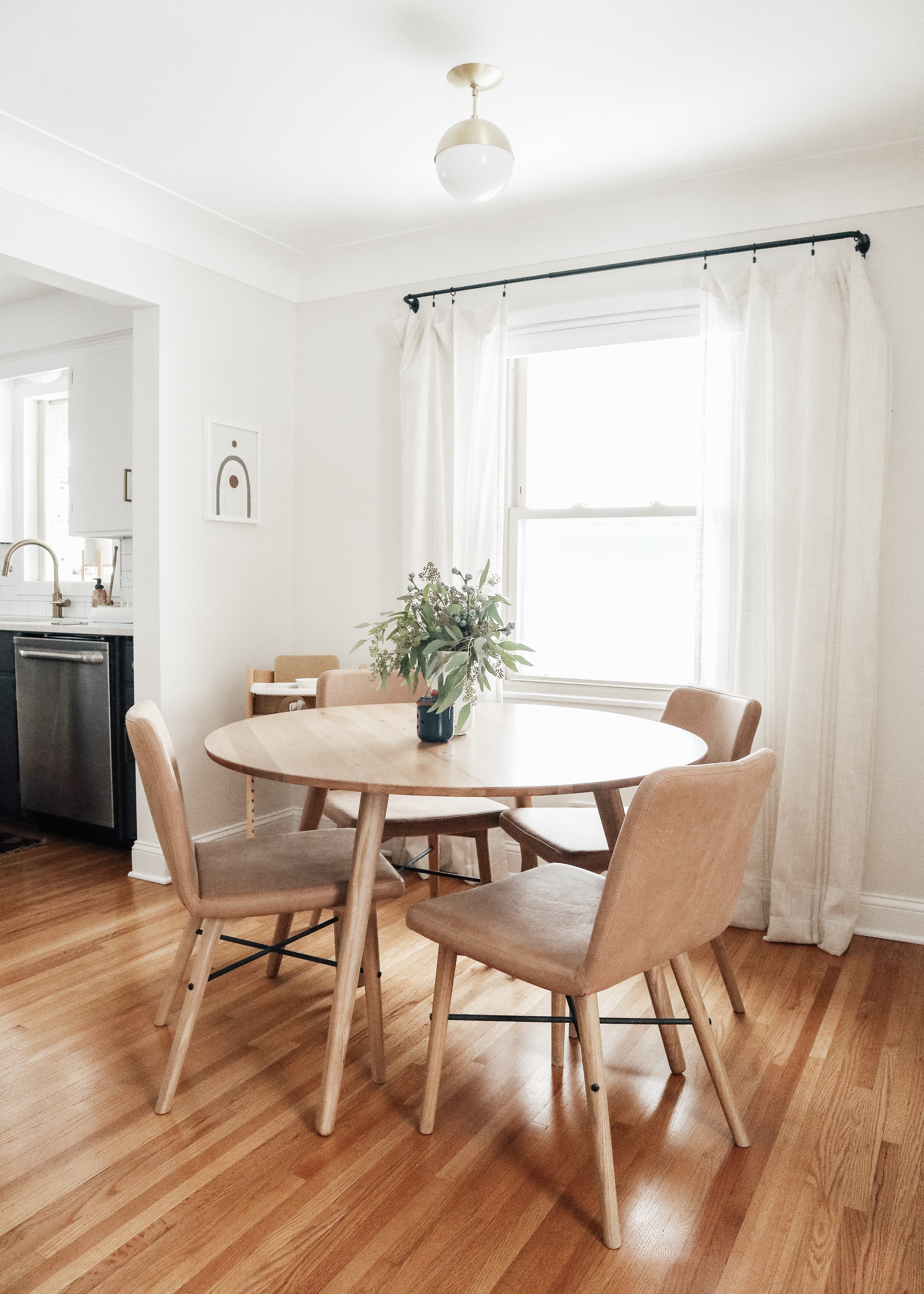
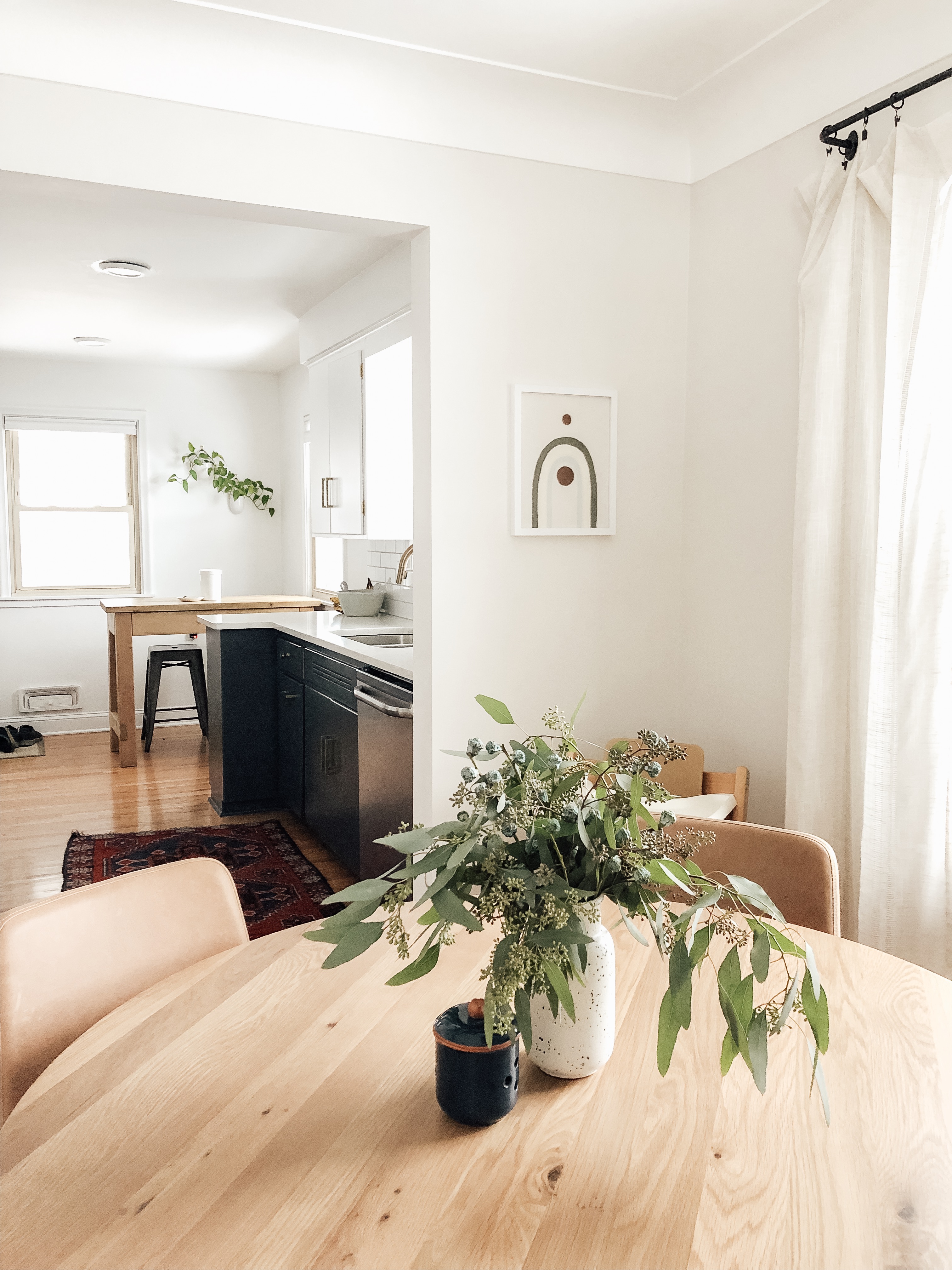
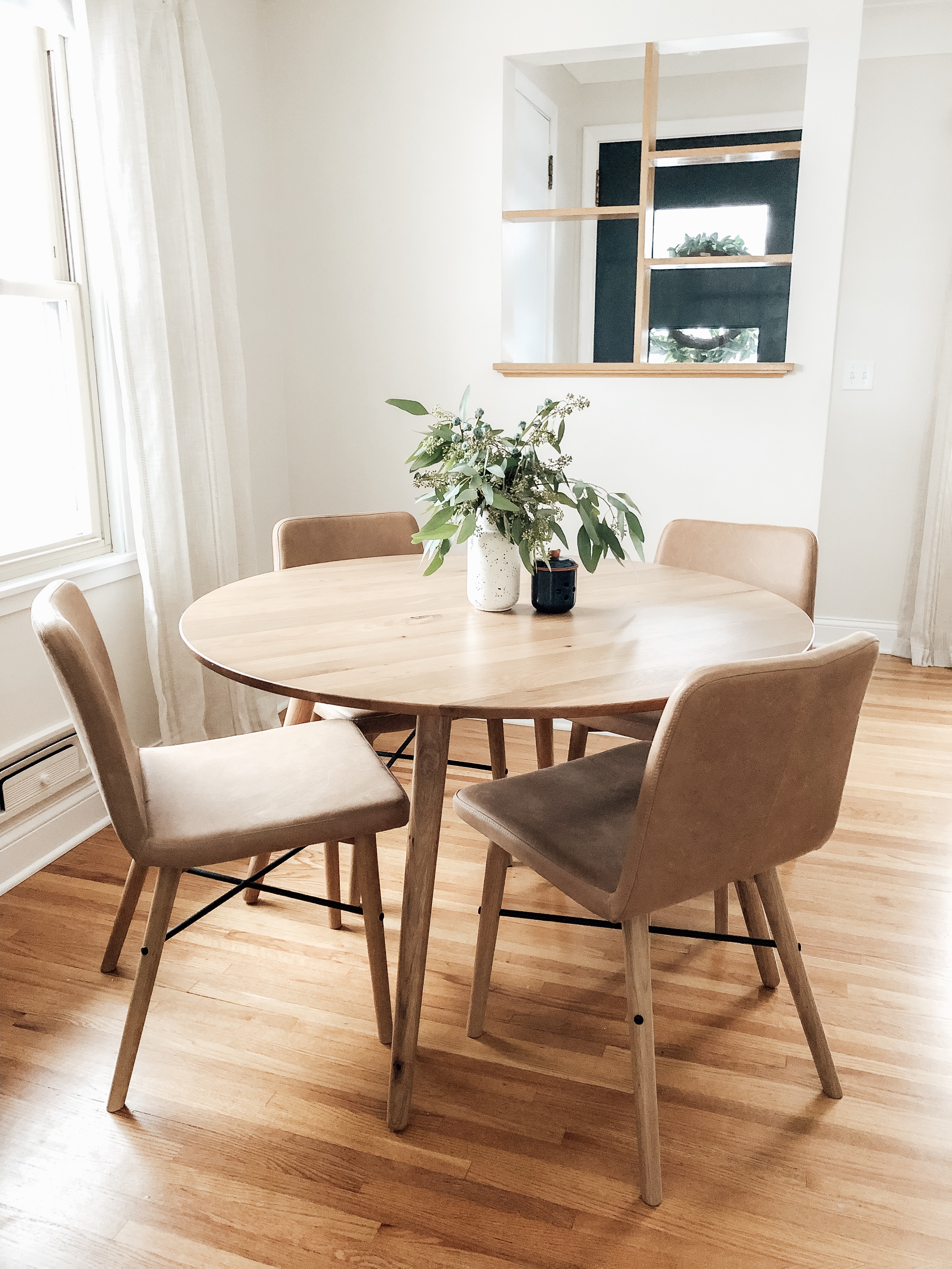
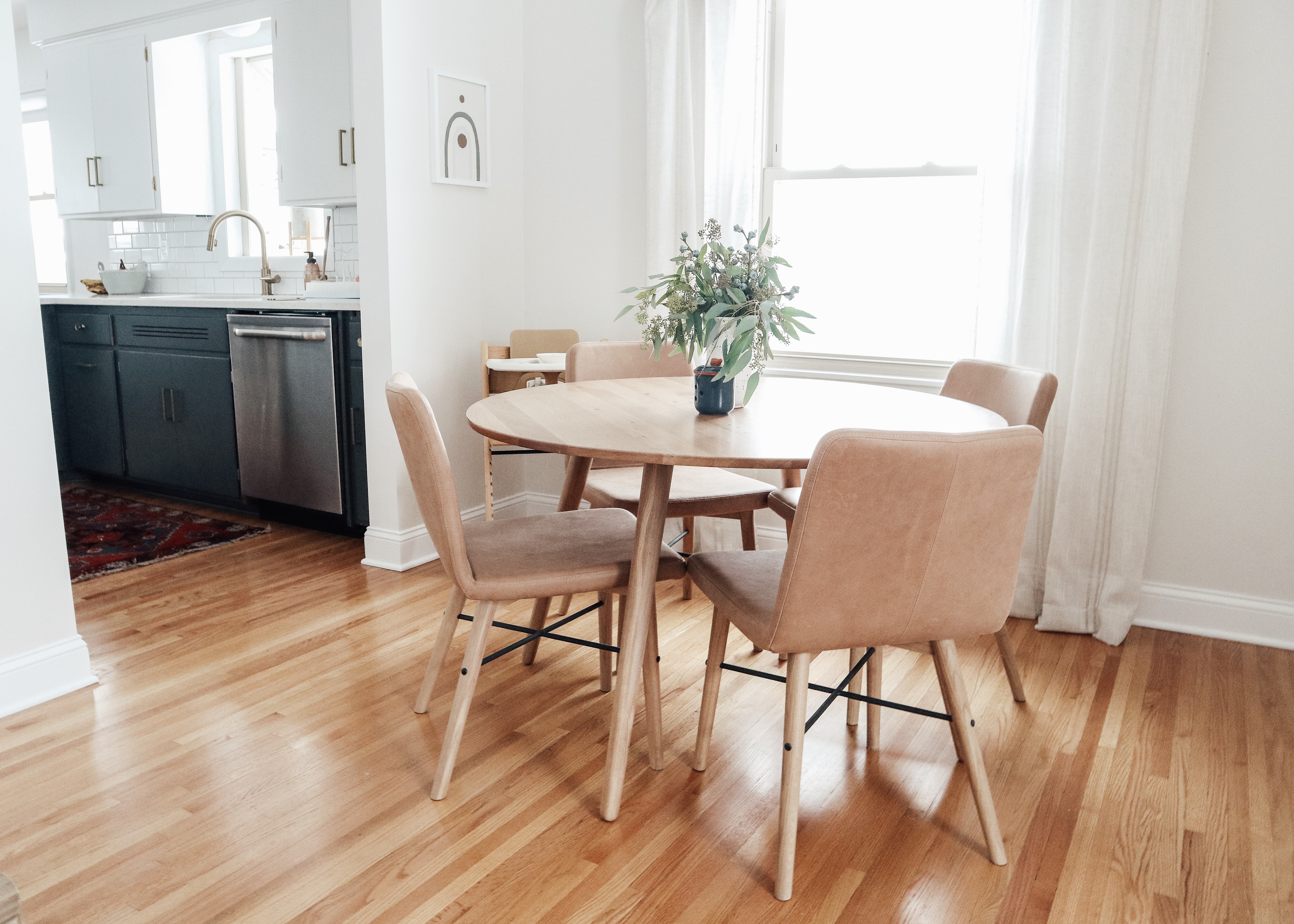
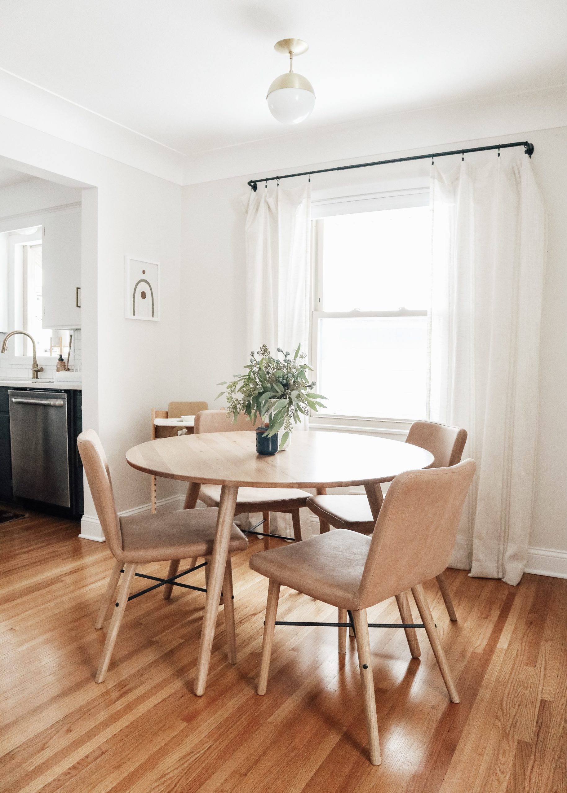
Sources: Article round dining room table | Article dining chairs | Target vase | thrifted navy candle holder | Stokke highchair | DIY rainbow wall art (similar option) | Schoolhouse Electric brass ceiling light
This was the area we knew was going to have to change quick once Harriet was mobile. The old table was what I liked to call my ‘frankenstein table’ as it was made up of a bottom from an old bistro table I had and DIY round wood top that was very sketchly attached to one another. Not exactly baby-friendly. Plus, Joel didn’t like the chairs I had. They were cute, but every time you sat down in them you thought them my snap and you’d fall flat on your ass. Great for hosting dinners with friends. Upgrading to this Article set makes me feel like a real adult with a real adult table. I can’t wait to have friends over for diner now!
[show_shopthepost_widget id=”3409010″]

absolutely love this!